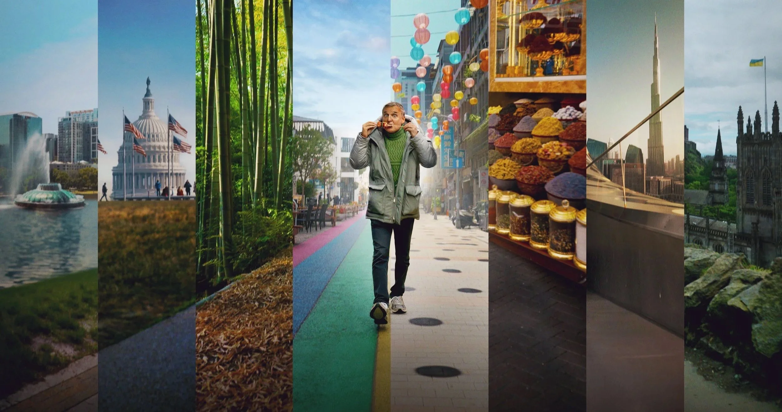
Distilling story
into image.
My work begins with identifying the core essence of a story — the emotional and thematic truth that must remain visible even at a glance. In commercial entertainment campaigns, visuals must resonate instantly while remaining faithful to the world, tone, and audience expectations of the title.
This process sits at the intersection of art and commerce. Each concept must be emotionally compelling, visually distinct, and also executable within production realities such as talent shoots, platform readability, and multi-format rollout. The goal is not simply to create beautiful images, but to distill complex narrative worlds into clear, human, and scalable visual systems.
The case studies below highlight how concept, tone, compositing, and execution come together to balance aesthetic integrity with mass audience clarity.
Featured Case Studies
YOU / Season 5
-
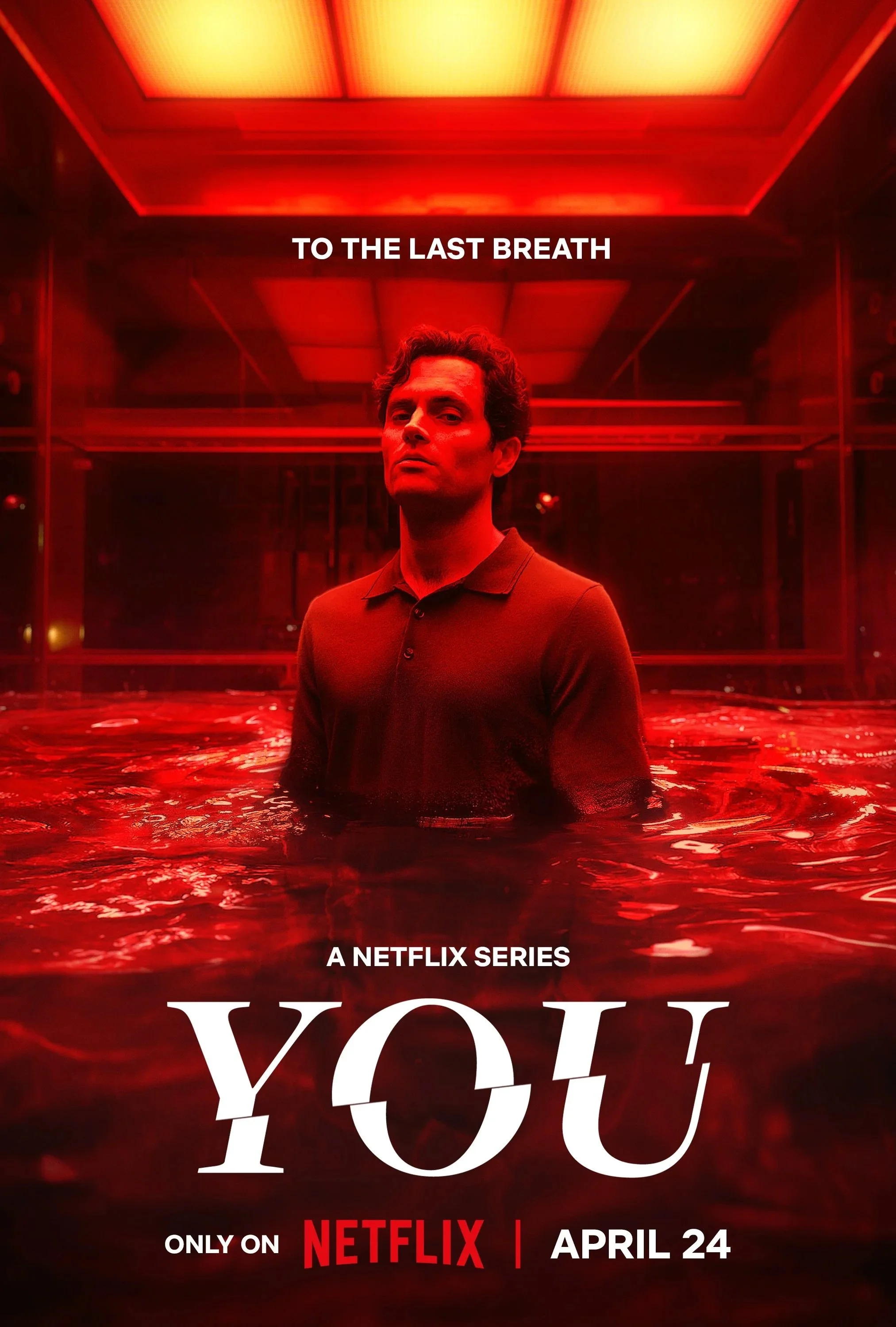
As the final season of the series, the artwork explored the idea that Joe’s past actions were inevitably catching up to him. The image needed to tease his fate without revealing it outright, conveying tension, consequence, and a sense of dark destiny unfolding. The goal was to creatately clear and recognizable at scale.
-
The direction centered on placing Joe inside the iconic glass cage — a defining element of the series — reversing his role from captor to captive. Rising red liquid was introduced as a symbolic stand-in for blood, representing the weight of his past victims without depicting literal violence. The composition aimed to balance elegance and dread, presenting a beautiful yet unsettling visual metaphor for inevitable consequence.
-
Talent recognizability required careful angle and lighting selection to maintain immediate identification.
The final image was composited from separately photographed elements: cage structure, water levels, reflections, and lighting passes.
Color consistency was maintained across the full campaign suite.
Artwork bleed and compositional framing were designed for multi-format platform breakouts.
-
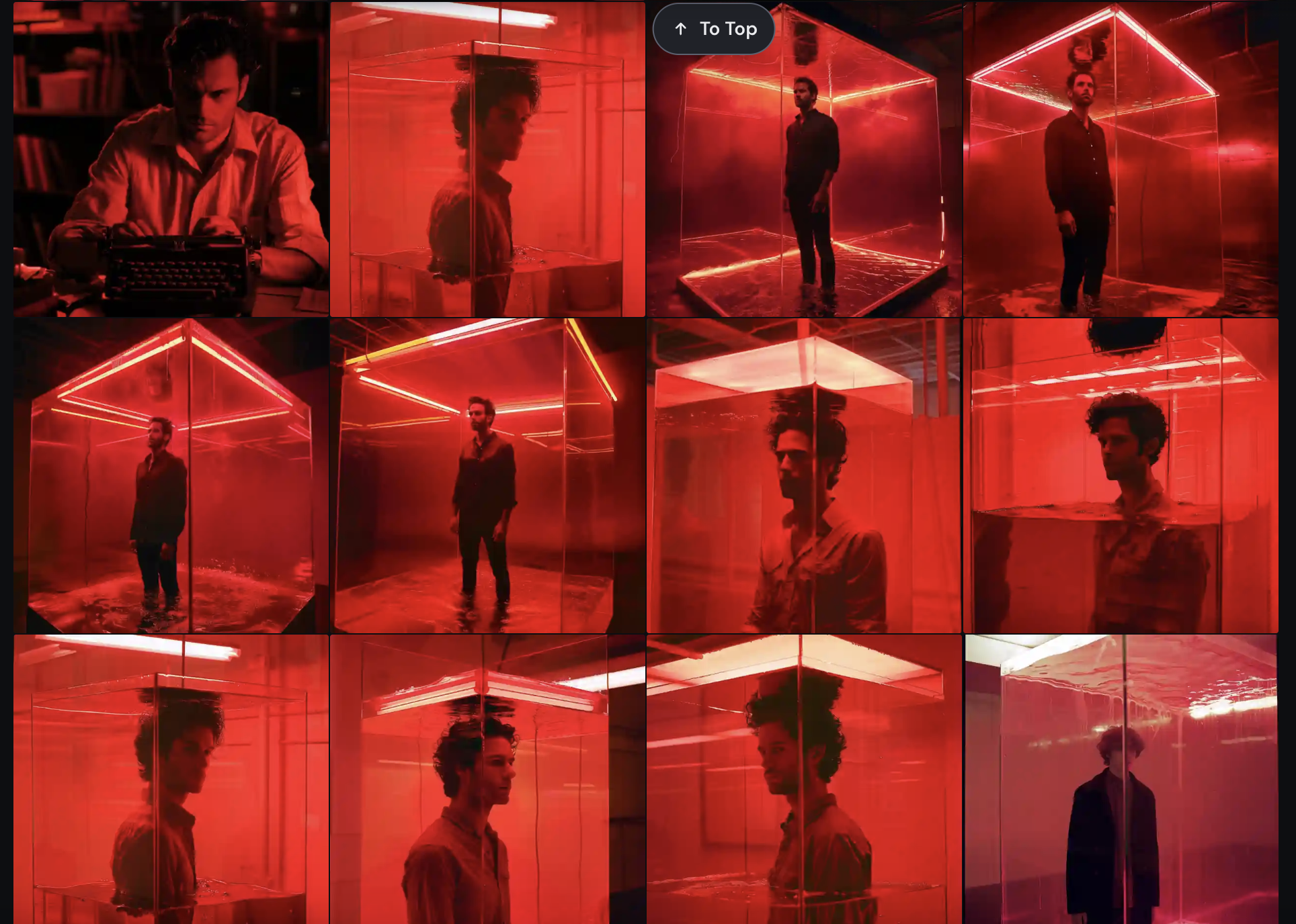
During early concepting, generative art was used to prototype the visual of a man inside a glass cube with rising red liquid at varying heights. Iterating through dozens of generated variations helped communicate the idea clearly to stakeholders and prove the concept’s feasibility for a real photoshoot. This marked a shift from relying on reference scraps to presenting fully realized conceptual imagery during the pitch phase.
-
The final key art translated the generative concept into a practical, shootable execution, resulting in a cohesive and emotionally resonant campaign image. The piece successfully conveyed inevitability and consequence while maintaining strong talent recognition and visual clarity. The final artwork was later recognized with a Clio Award nomination.


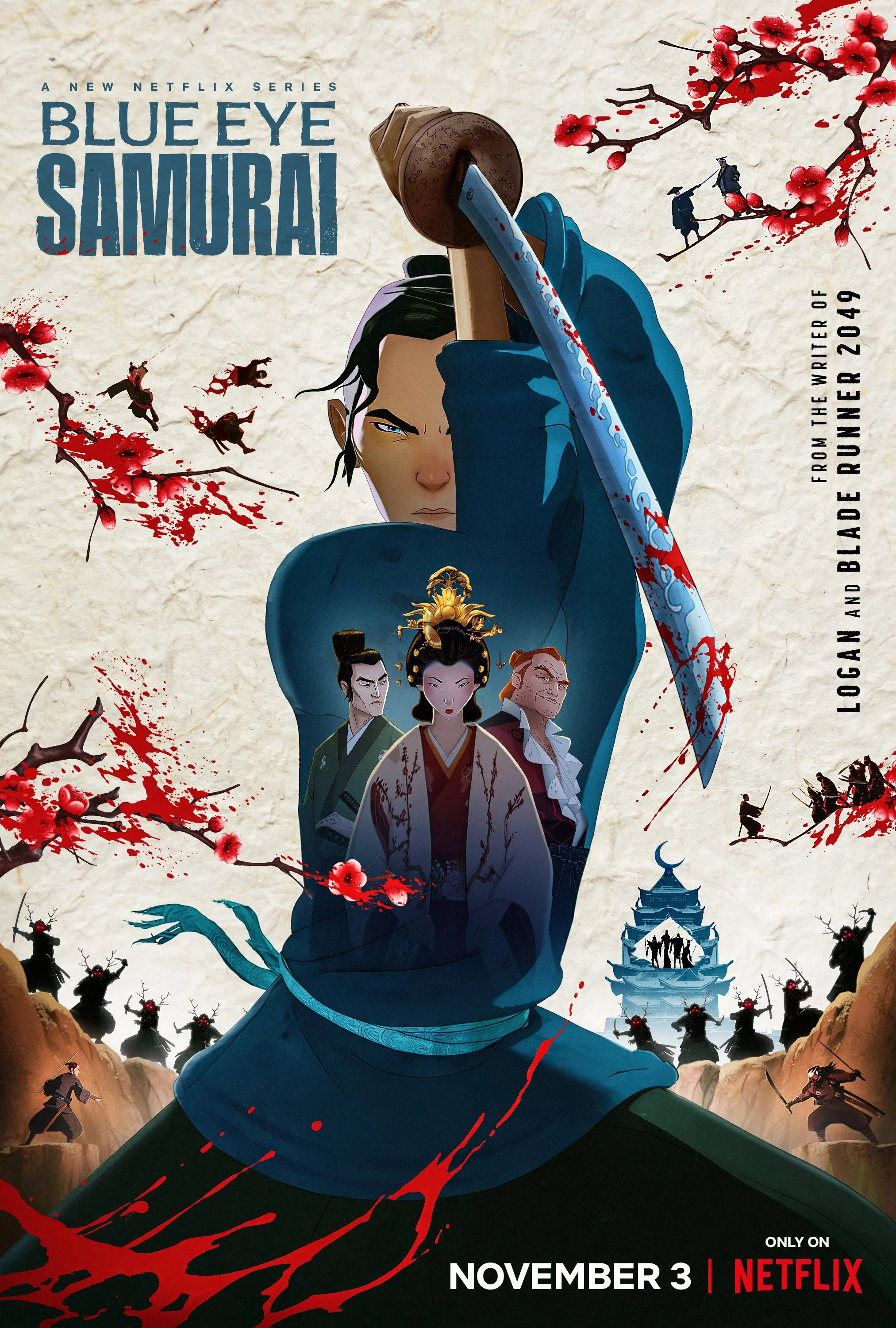
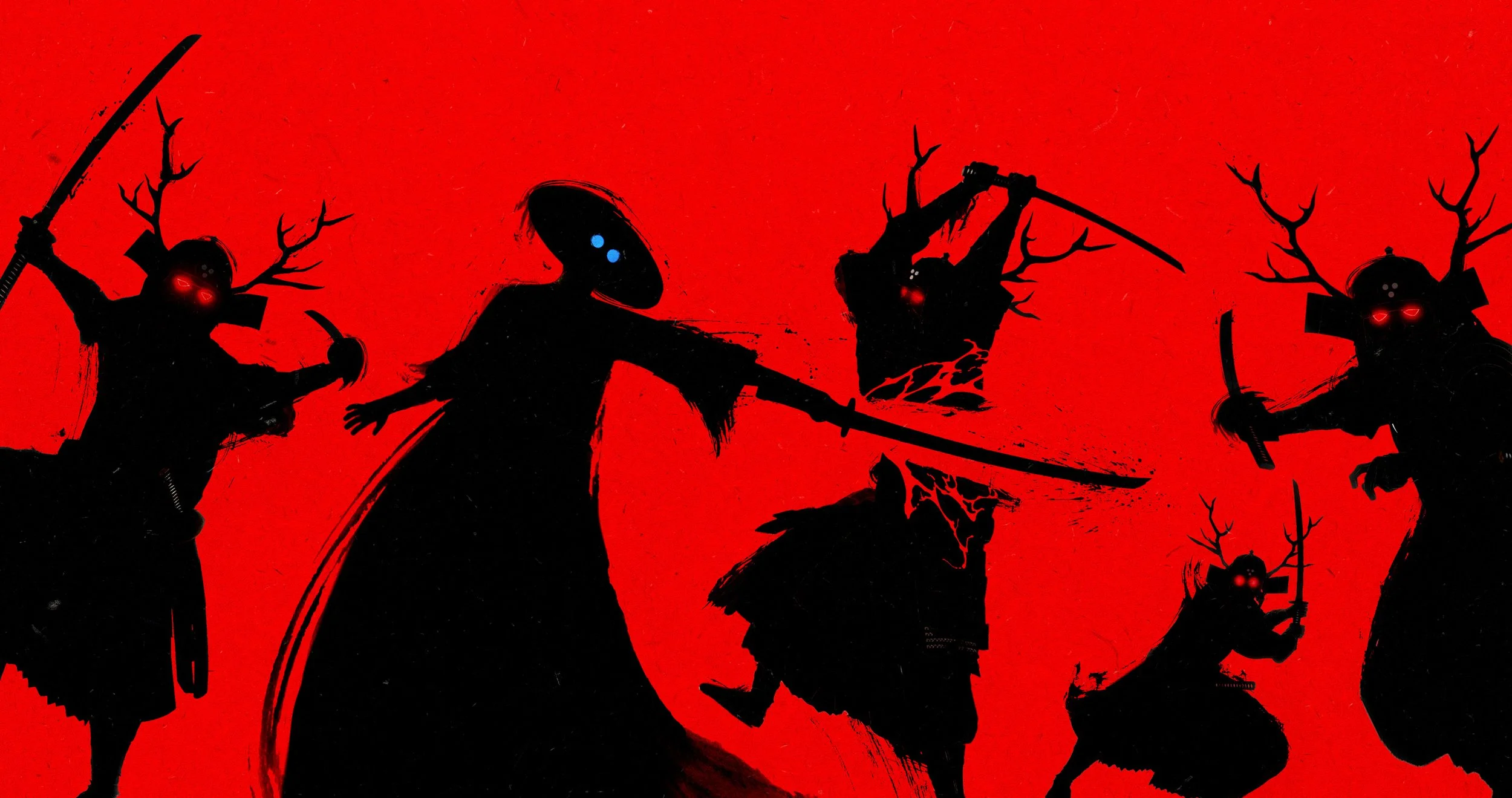
Blue Eye Samurai / Season 1
-
Workshop participants ease into the day with creative prompts and a welcome circle to get grounded and set the tone.
-
Our first session focuses on the foundations of floral design. From tool basics to flower care and simple composition tips, you’ll start building confidence and finding your creative rhythm.
-
Participants will be responsible for brining their own lunch, but we'll provide water and some additional snacks throughout the day.
-
With the basics fresh, we’ll dive into hands-on arranging. We’ll explore shape, scale, and movement while encouraging personal style through floral design.
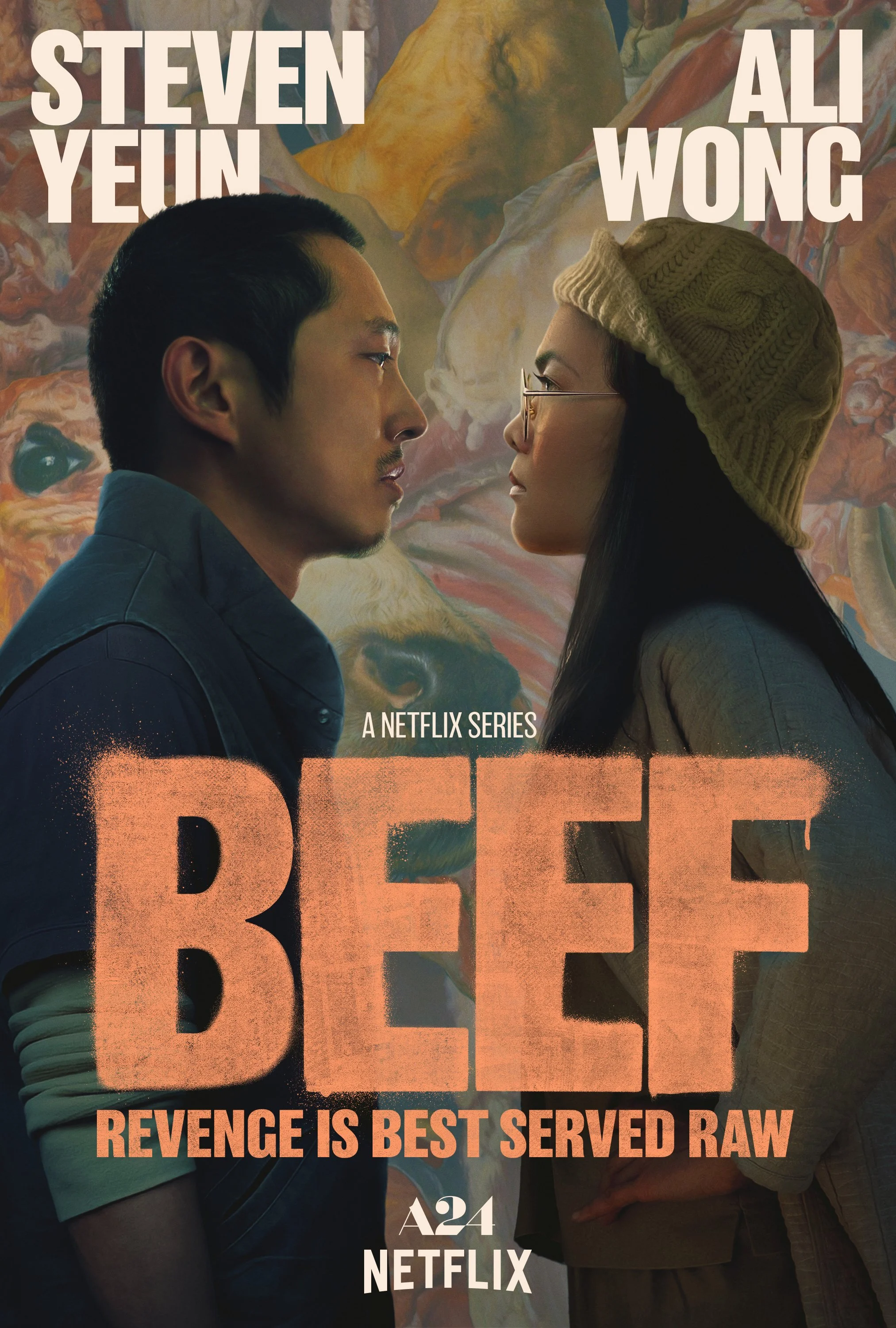
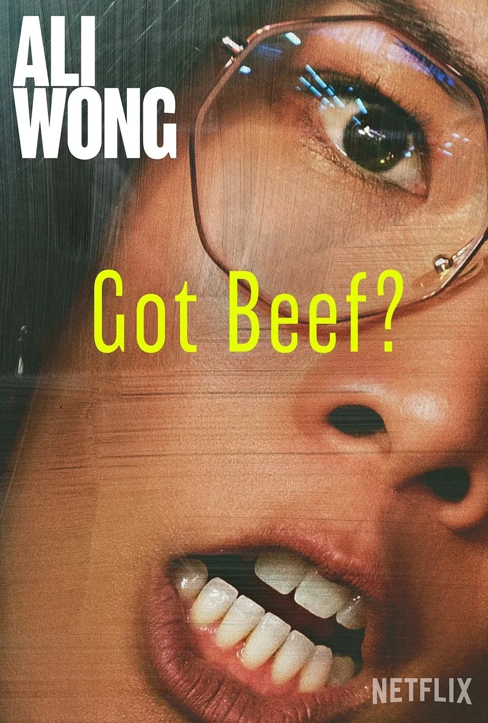
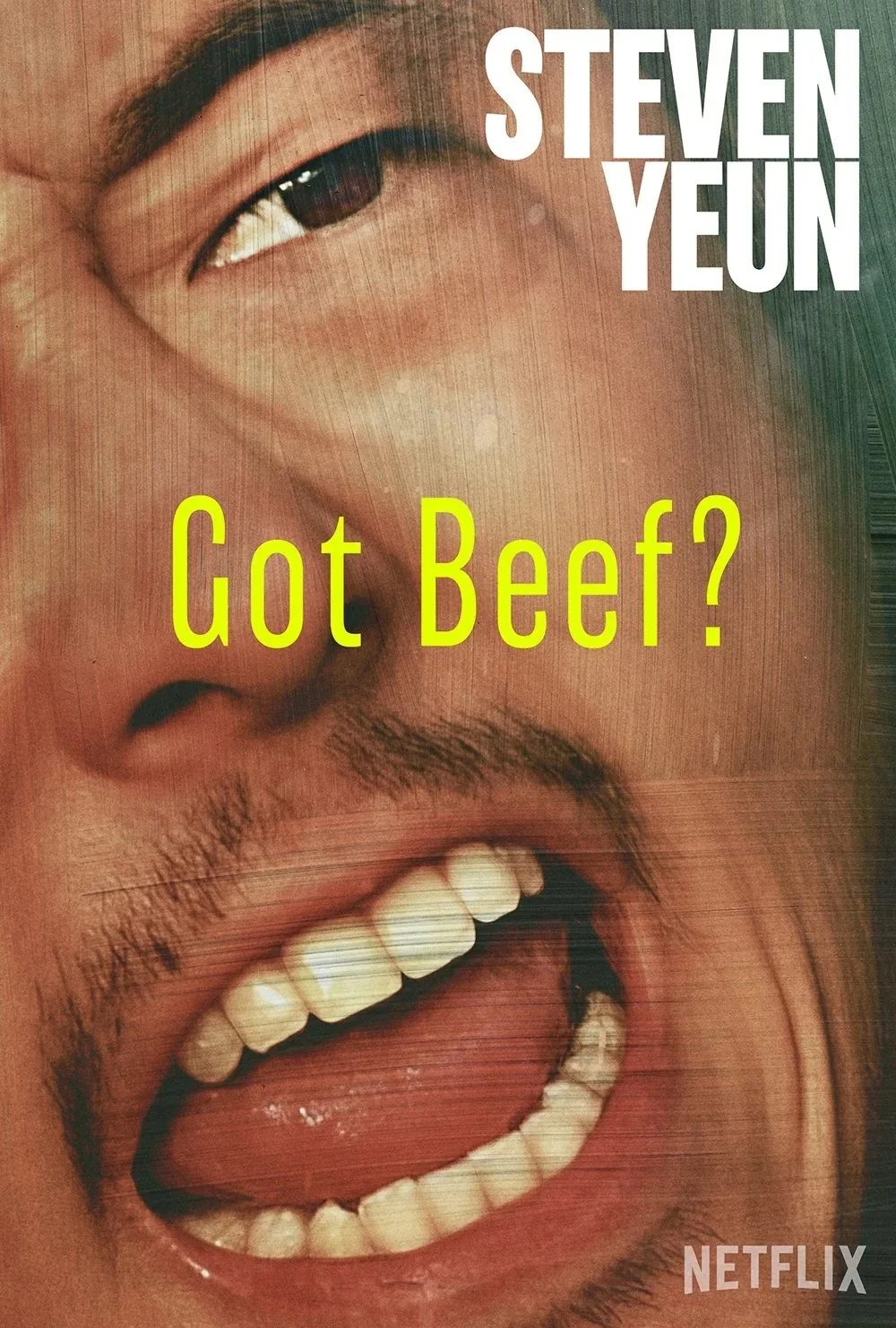
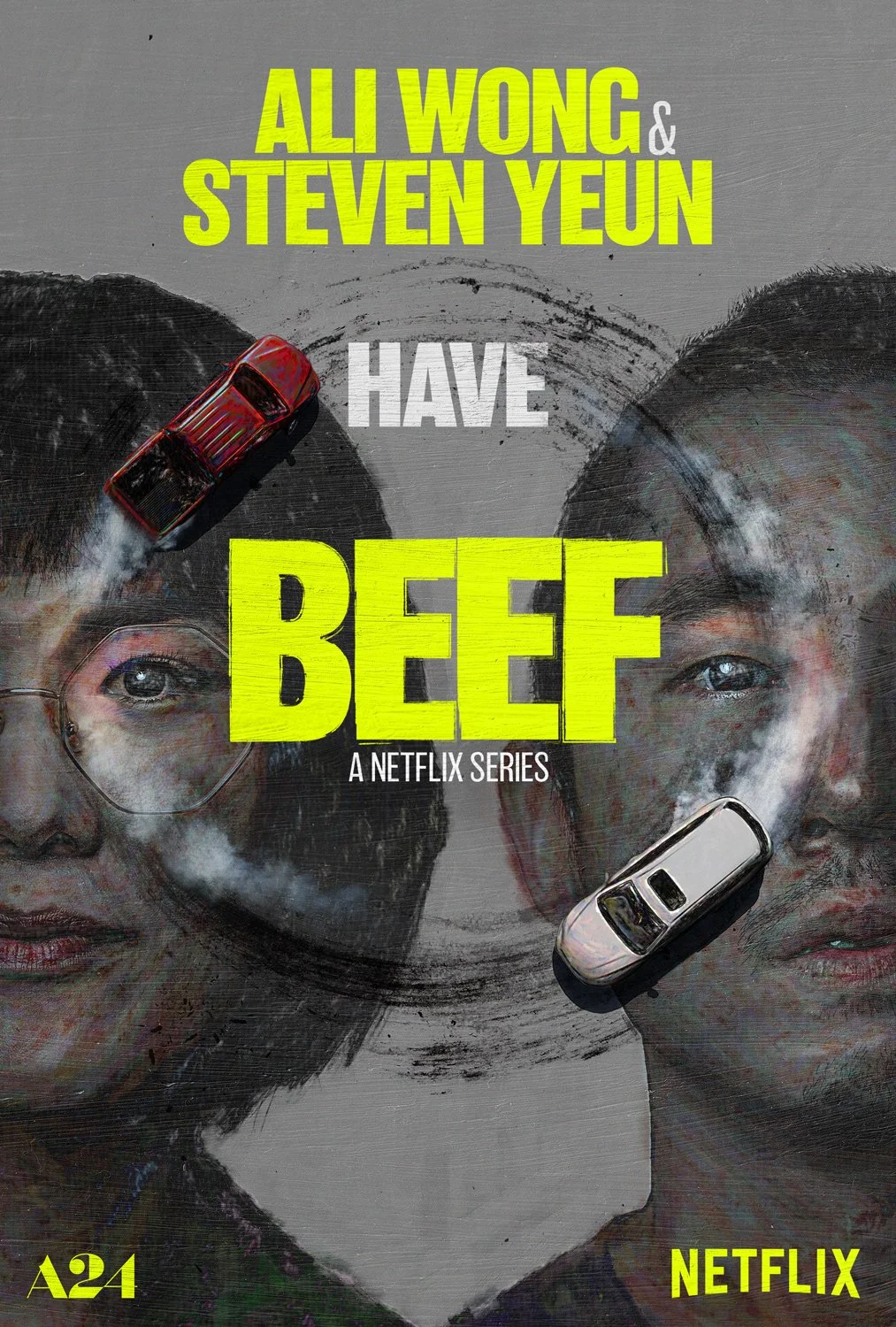
BEEF / Season 1
-
As the final season of the series, the artwork explored the idea that Joe’s past actions were inevitably catching up to him. The image needed to tease his fate without revealing it outright, conveying tension, consequence, and a sense of dark destiny unfolding. The goal was to creatately clear and recognizable at scale.
-
The direction centered on placing Joe inside the iconic glass cage — a defining element of the series — reversing his role from captor to captive. Rising red liquid was introduced as a symbolic stand-in for blood, representing the weight of his past victims without depicting literal violence. The composition aimed to balance elegance and dread, presenting a beautiful yet unsettling visual metaphor for inevitable consequence.
-
Talent recognizability required careful angle and lighting selection to maintain immediate identification.
The final image was composited from separately photographed elements: cage structure, water levels, reflections, and lighting passes.
Color consistency was maintained across the full campaign suite.
Artwork bleed and compositional framing were designed for multi-format platform breakouts.
-
During early concepting, generative art was used to prototype the visual of a man inside a glass cube with rising red liquid at varying heights. Iterating through dozens of generated variations helped communicate the idea clearly to stakeholders and prove the concept’s feasibility for a real photoshoot. This marked a shift from relying on reference scraps to presenting fully realized conceptual imagery during the pitch phase.
-
The final key art translated the generative concept into a practical, shootable execution, resulting in a cohesive and emotionally resonant campaign image. The piece successfully conveyed inevitability and consequence while maintaining strong talent recognition and visual clarity. The final artwork was later recognized with a Clio Award nomination.
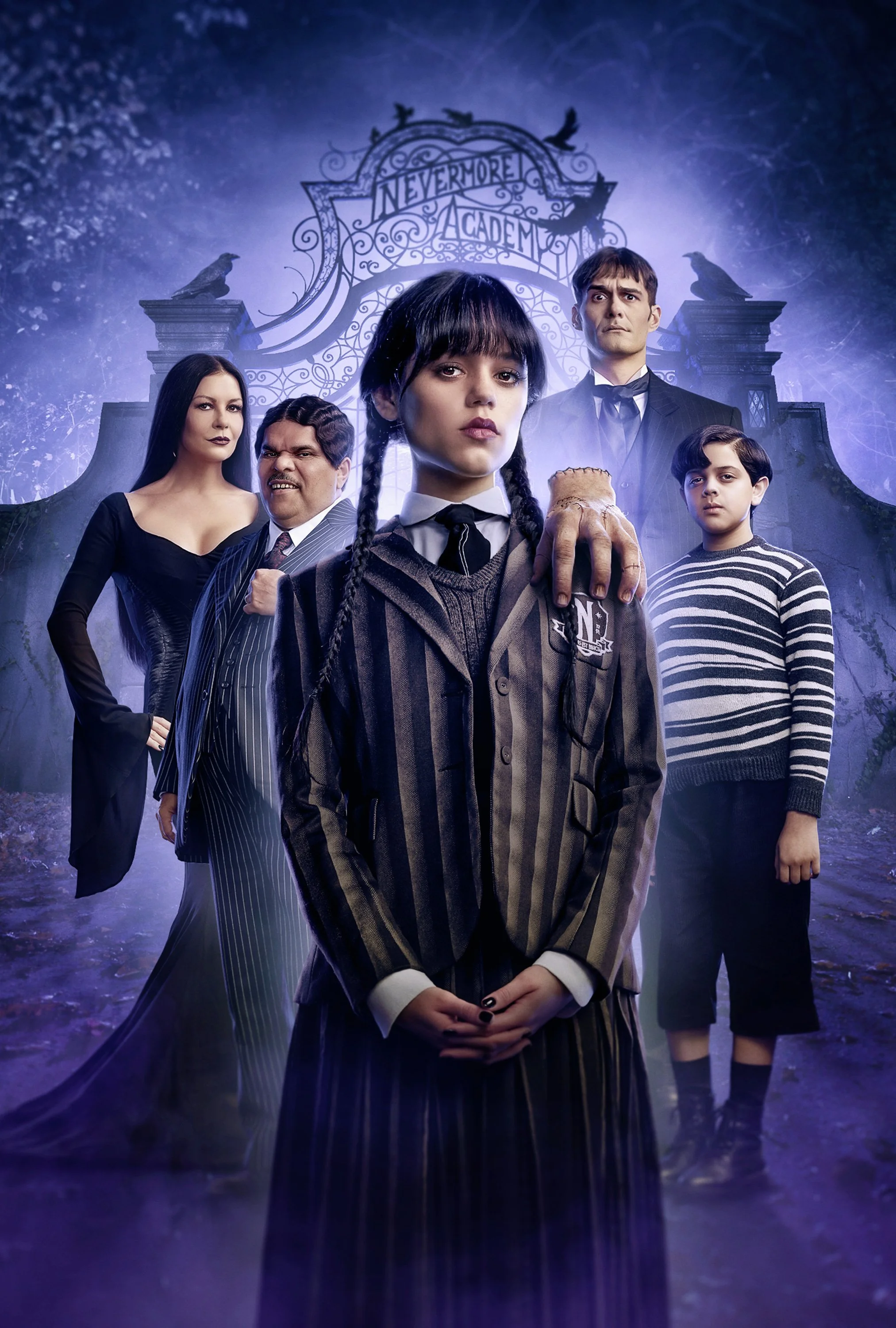
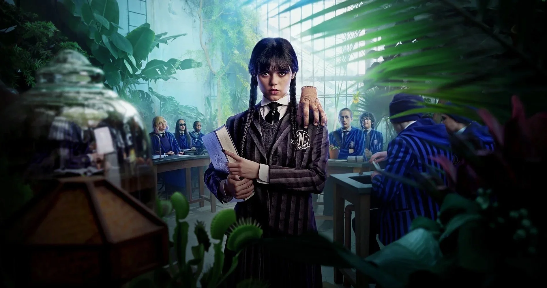
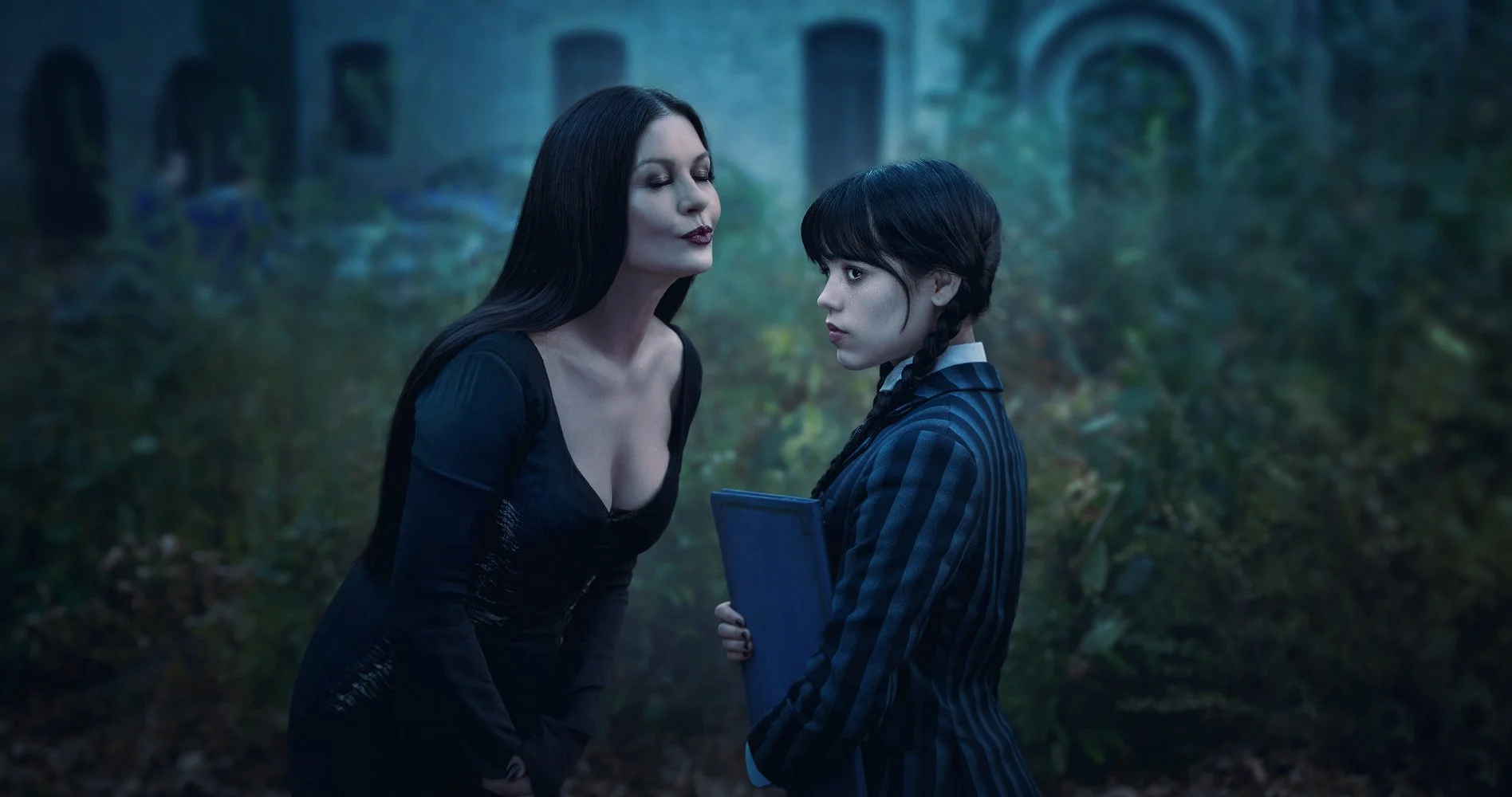
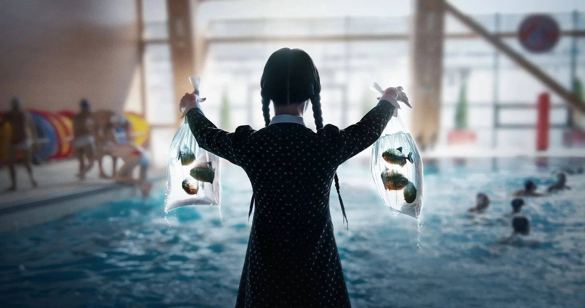
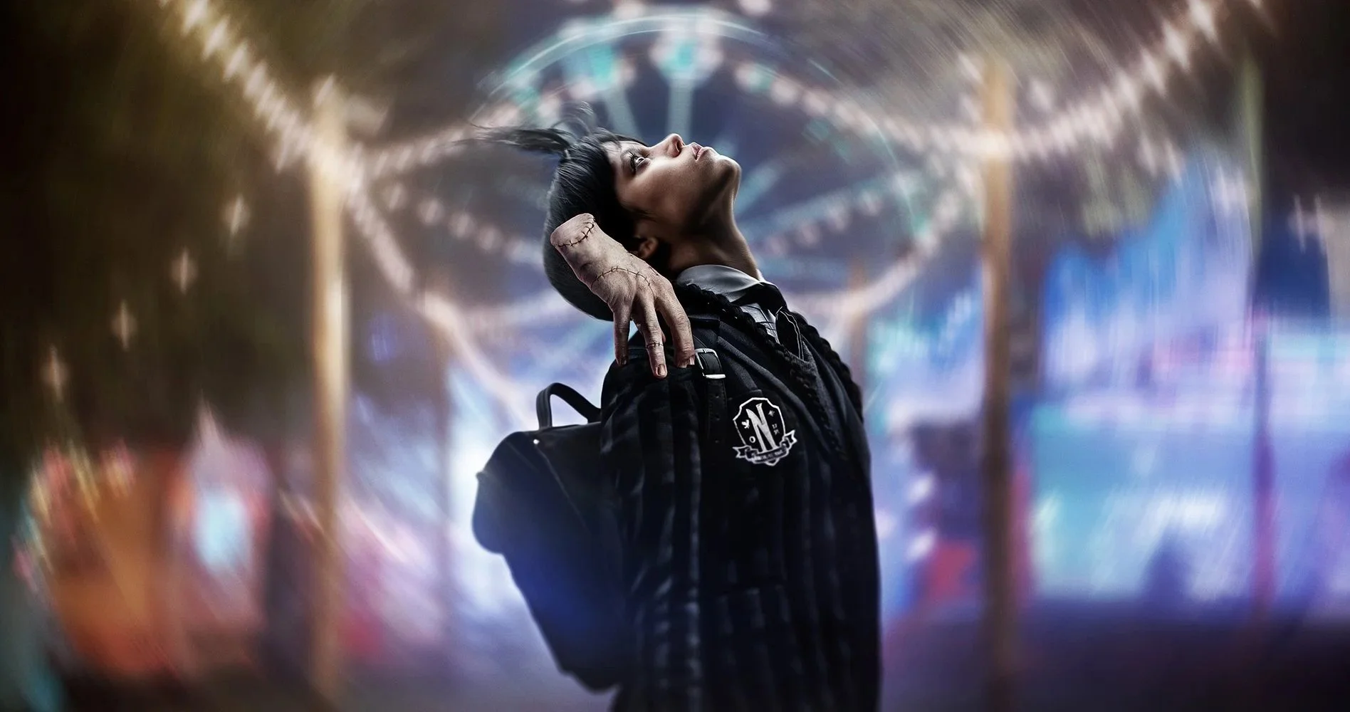
Wednesday / Season 1
-
Workshop participants ease into the day with creative prompts and a welcome circle to get grounded and set the tone.
-
Our first session focuses on the foundations of floral design. From tool basics to flower care and simple composition tips, you’ll start building confidence and finding your creative rhythm.
-
Participants will be responsible for brining their own lunch, but we'll provide water and some additional snacks throughout the day.
-
With the basics fresh, we’ll dive into hands-on arranging. We’ll explore shape, scale, and movement while encouraging personal style through floral design.
ADD MUT BREAKOUT
Somebody Feed Phil / Season 7
-
As the final season of the series, the artwork explored the idea that Joe’s past actions were inevitably catching up to him. The image needed to tease his fate without revealing it outright, conveying tension, consequence, and a sense of dark destiny unfolding. The goal was to creatately clear and recognizable at scale.
-
The direction centered on placing Joe inside the iconic glass cage — a defining element of the series — reversing his role from captor to captive. Rising red liquid was introduced as a symbolic stand-in for blood, representing the weight of his past victims without depicting literal violence. The composition aimed to balance elegance and dread, presenting a beautiful yet unsettling visual metaphor for inevitable consequence.
-
Talent recognizability required careful angle and lighting selection to maintain immediate identification.
The final image was composited from separately photographed elements: cage structure, water levels, reflections, and lighting passes.
Color consistency was maintained across the full campaign suite.
Artwork bleed and compositional framing were designed for multi-format platform breakouts.
-
During early concepting, generative art was used to prototype the visual of a man inside a glass cube with rising red liquid at varying heights. Iterating through dozens of generated variations helped communicate the idea clearly to stakeholders and prove the concept’s feasibility for a real photoshoot. This marked a shift from relying on reference scraps to presenting fully realized conceptual imagery during the pitch phase.
-
The final key art translated the generative concept into a practical, shootable execution, resulting in a cohesive and emotionally resonant campaign image. The piece successfully conveyed inevitability and consequence while maintaining strong talent recognition and visual clarity. The final artwork was later recognized with a Clio Award nomination.