Distilling story
into image.
My work begins with identifying the core essence of a story — the emotional and thematic truth that must remain visible even at a glance. In commercial entertainment campaigns, visuals must resonate instantly while remaining faithful to the world, tone, and audience expectations of the title.
This process sits at the intersection of art and commerce. Each concept must be emotionally compelling, visually distinct, and also executable within production realities such as talent shoots, platform readability, and multi-format rollout. The goal is not simply to create beautiful images, but to distill complex narrative worlds into clear, human, and scalable visual systems.
The case studies below highlight how concept, tone, compositing, and execution come together to balance aesthetic integrity with mass audience clarity.
Featured Case Studies
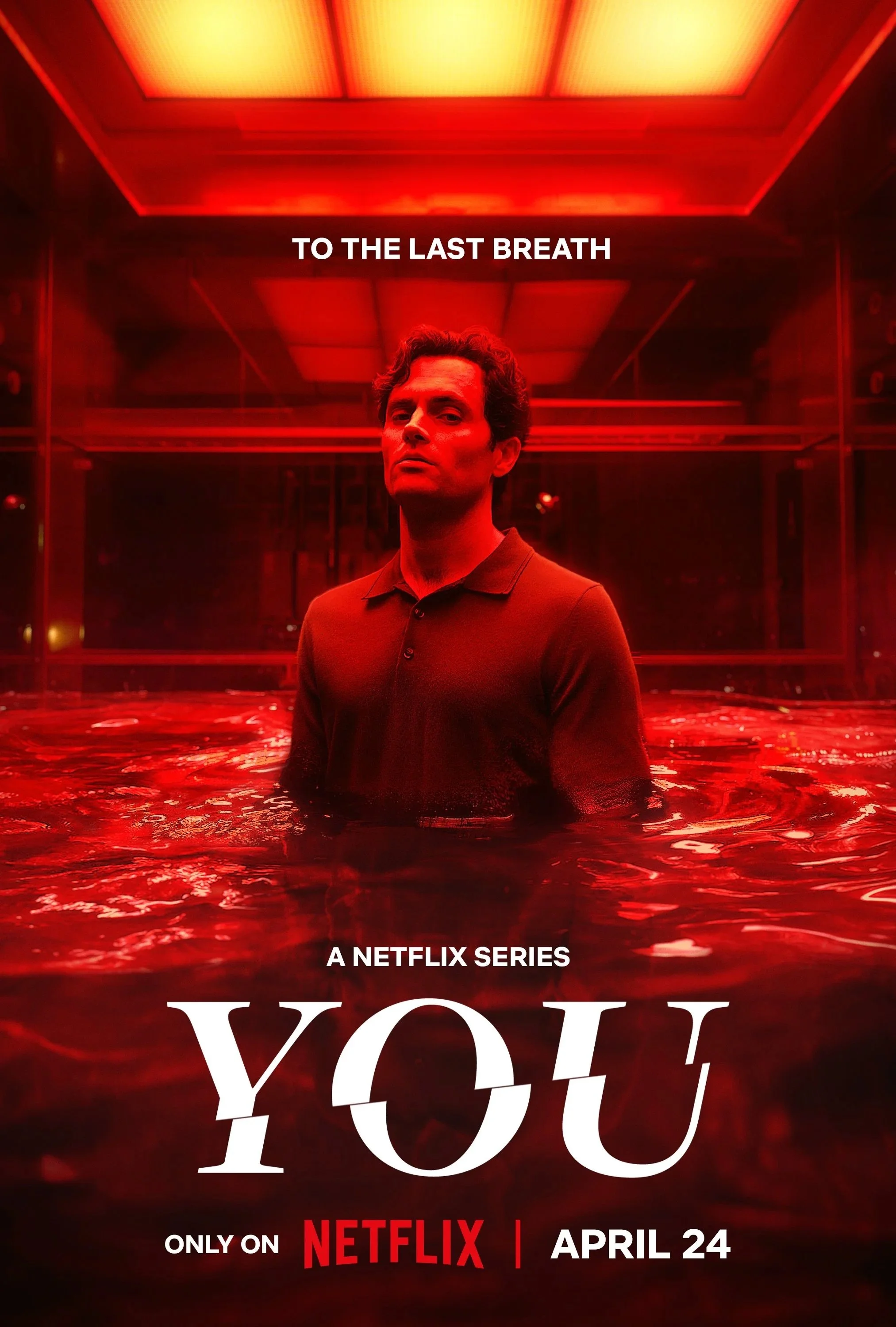
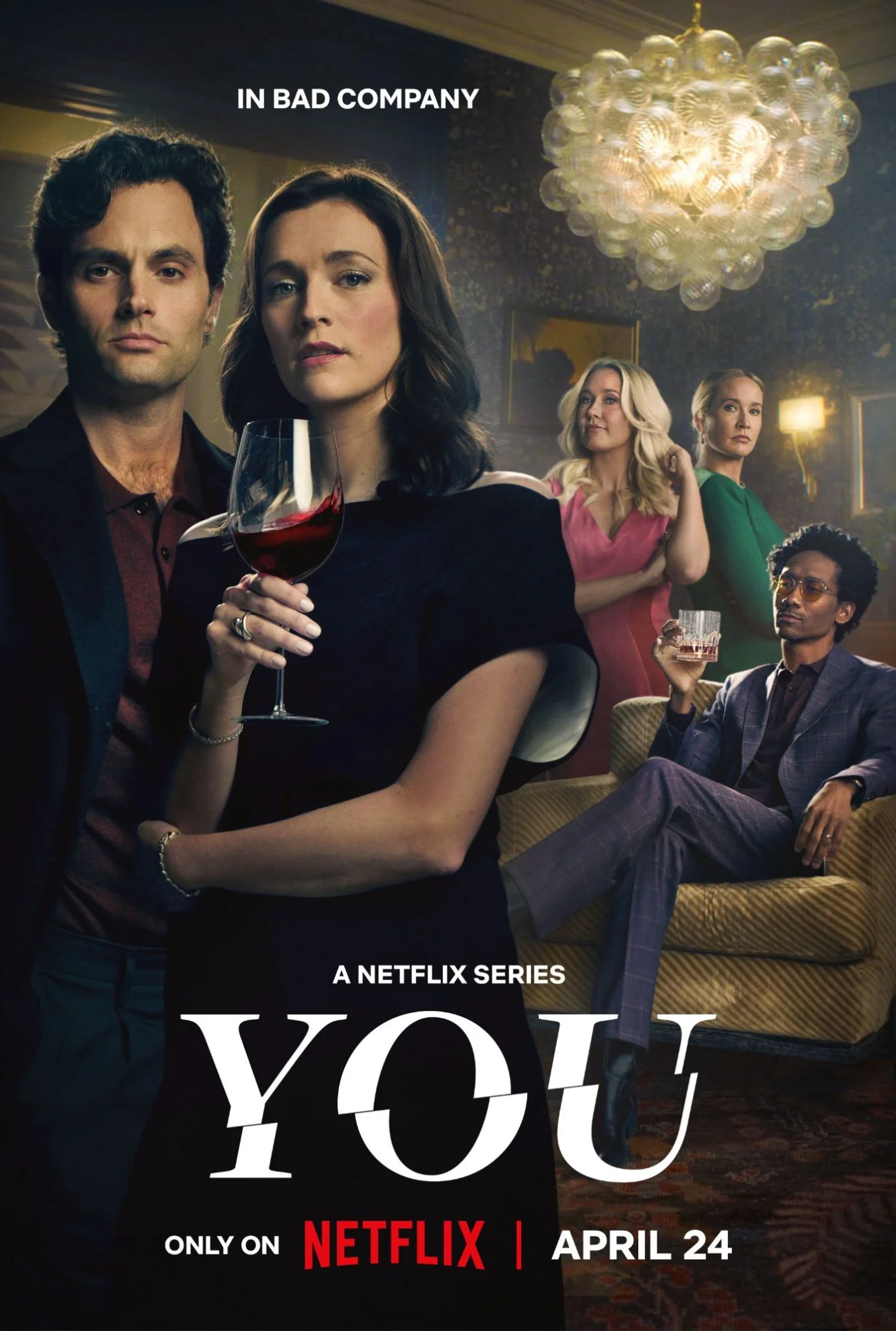
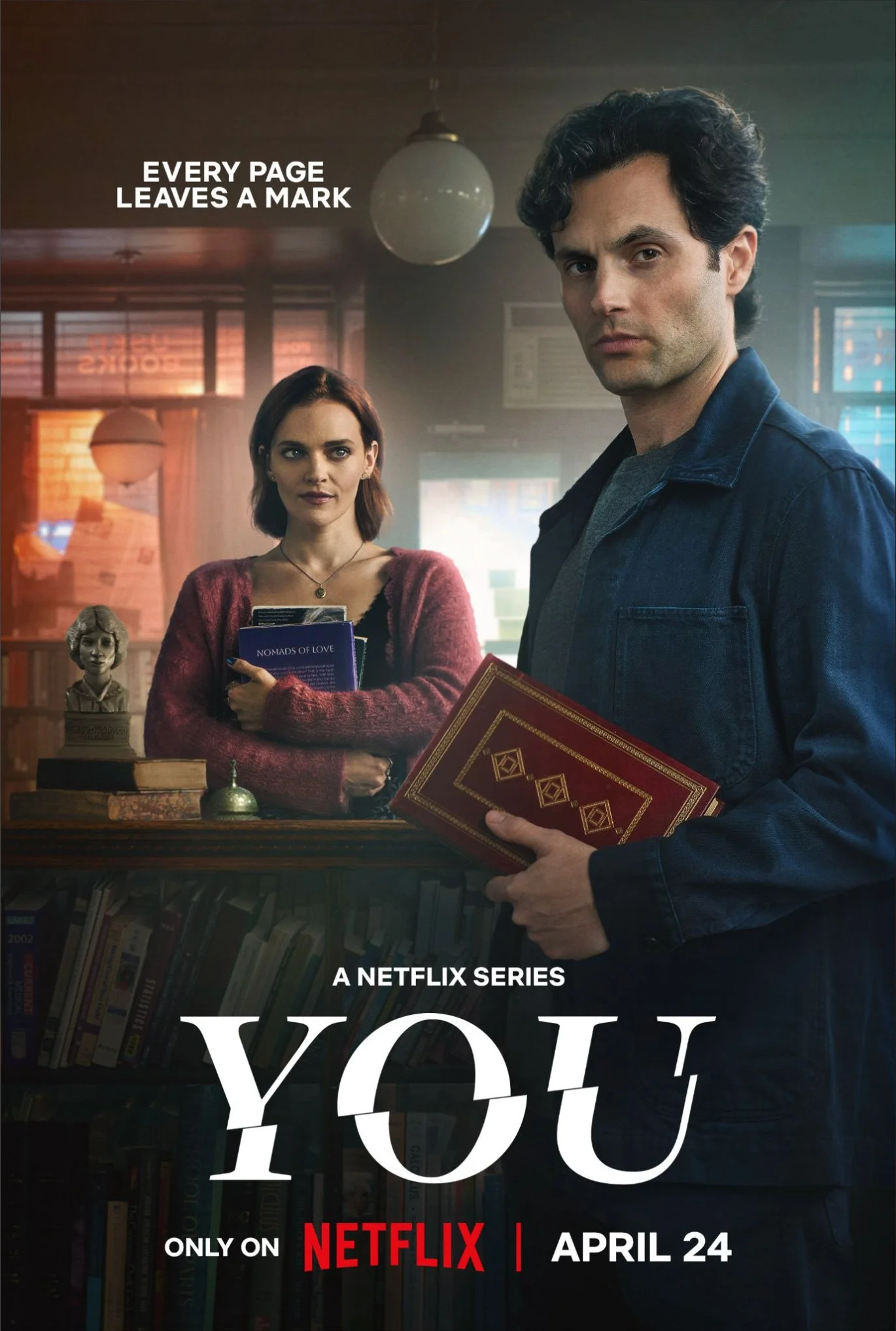
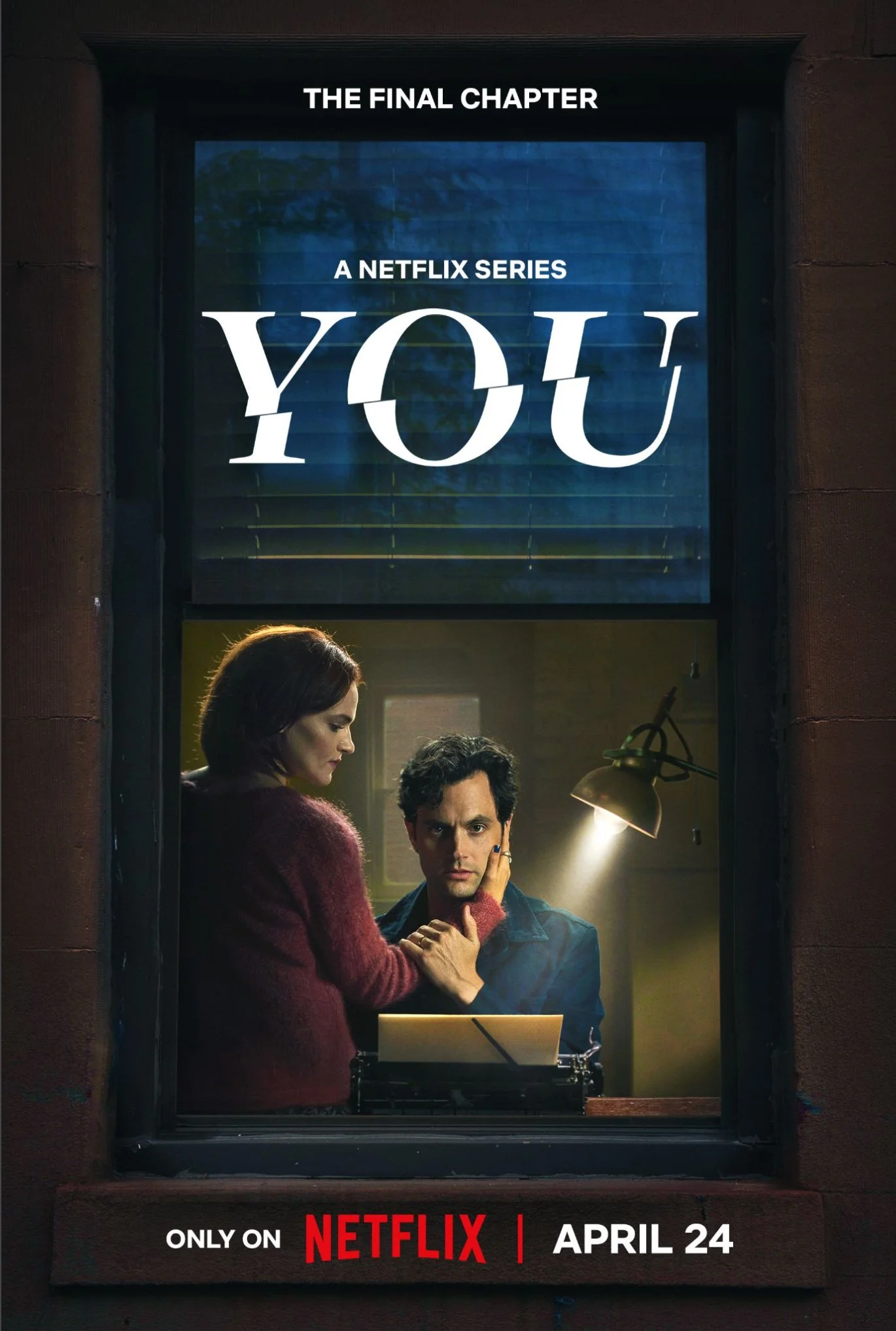
YOU / Season 5
-
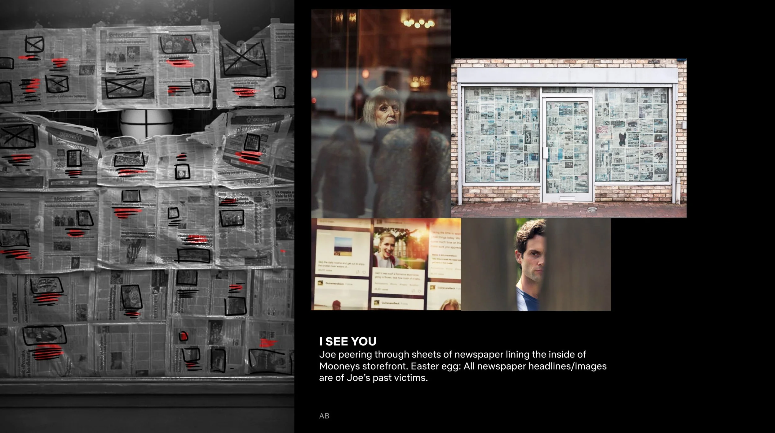
As the final season of the series, the artwork explored the idea that Joe's past actions were inevitably catching up to him. The image needed to tease his fate without revealing it outright, conveying tension, consequence, and a sense of dark destiny unfolding. The goal was to be immediately clear and recognizable at scale.
-
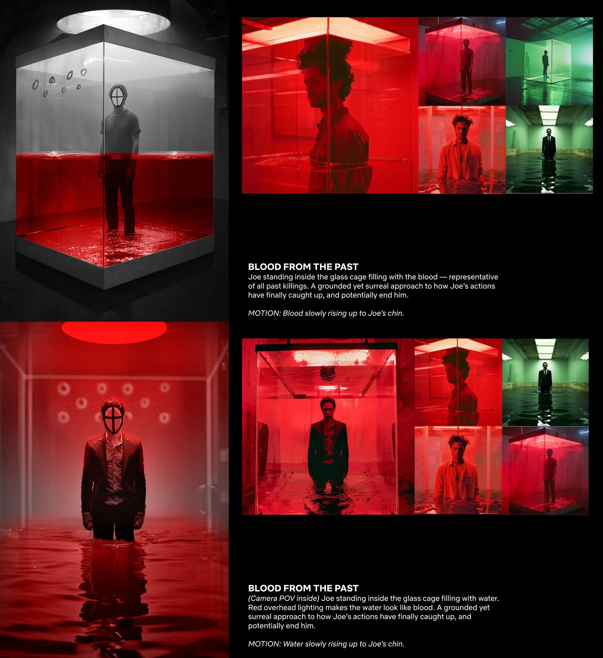
The direction centered on placing Joe inside the iconic glass cage — a defining element of the series — reversing his role from captor to captive. Rising red liquid was introduced as a symbolic stand-in for blood, representing the weight of his past victims without depicting literal violence. The composition aimed to balance elegance and dread, presenting a beautiful yet unsettling visual metaphor for inevitable consequence.
-
The final artwork required extensive compositing due to physical production limitations. The cube, water elements, reflections, and talent were captured separately and then seamlessly combined. Additional considerations included maintaining strong talent recognition, ensuring consistent color values across the campaign suite, and preserving sufficient bleed and clarity for multiple platform formats and international deliverables.
-
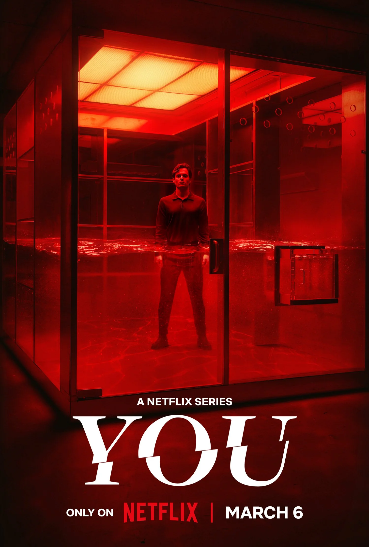
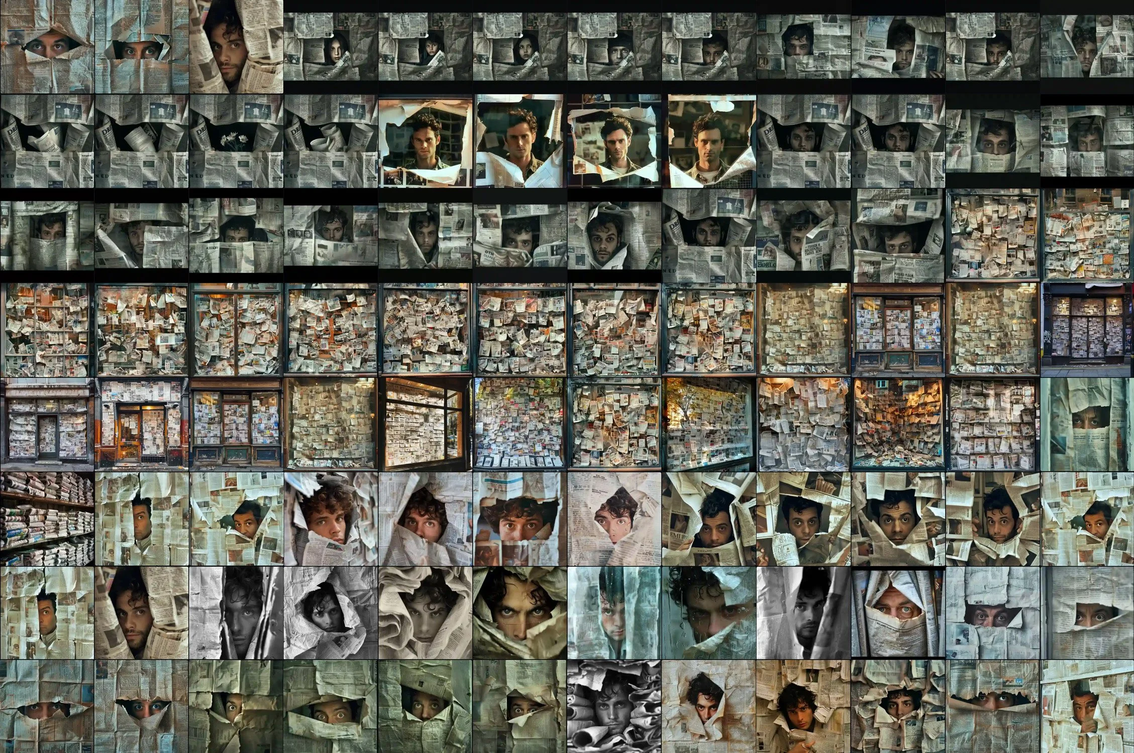
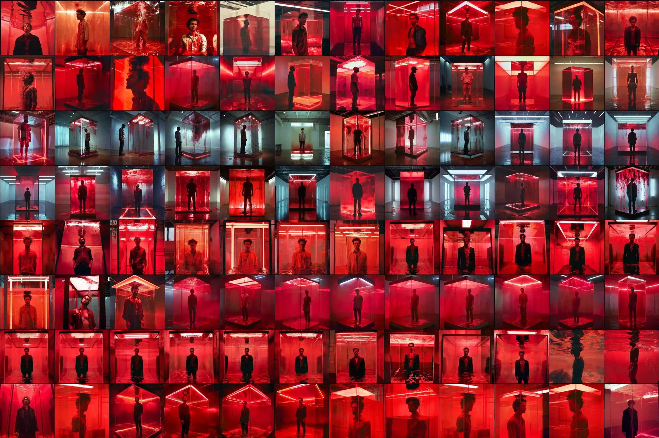
During early concepting, generative art was used to prototype the visual of a man inside a glass cube with rising red liquid at varying heights. Iterating through dozens of generated variations helped communicate the idea clearly to stakeholders and prove the concept’s feasibility before committing to a full photoshoot. This marked a shift from searching for references that may not exist, to simply creating what's imagined — at a fidelity close enough to stand in for the real thing.
-
The final key art translated the generative concept into a practical, shootable execution, resulting in a cohesive and emotionally resonant campaign image. The piece successfully conveyed inevitability and consequence while maintaining strong talent recognition and visual clarity. The final artwork was later recognized with a Clio Award nomination.


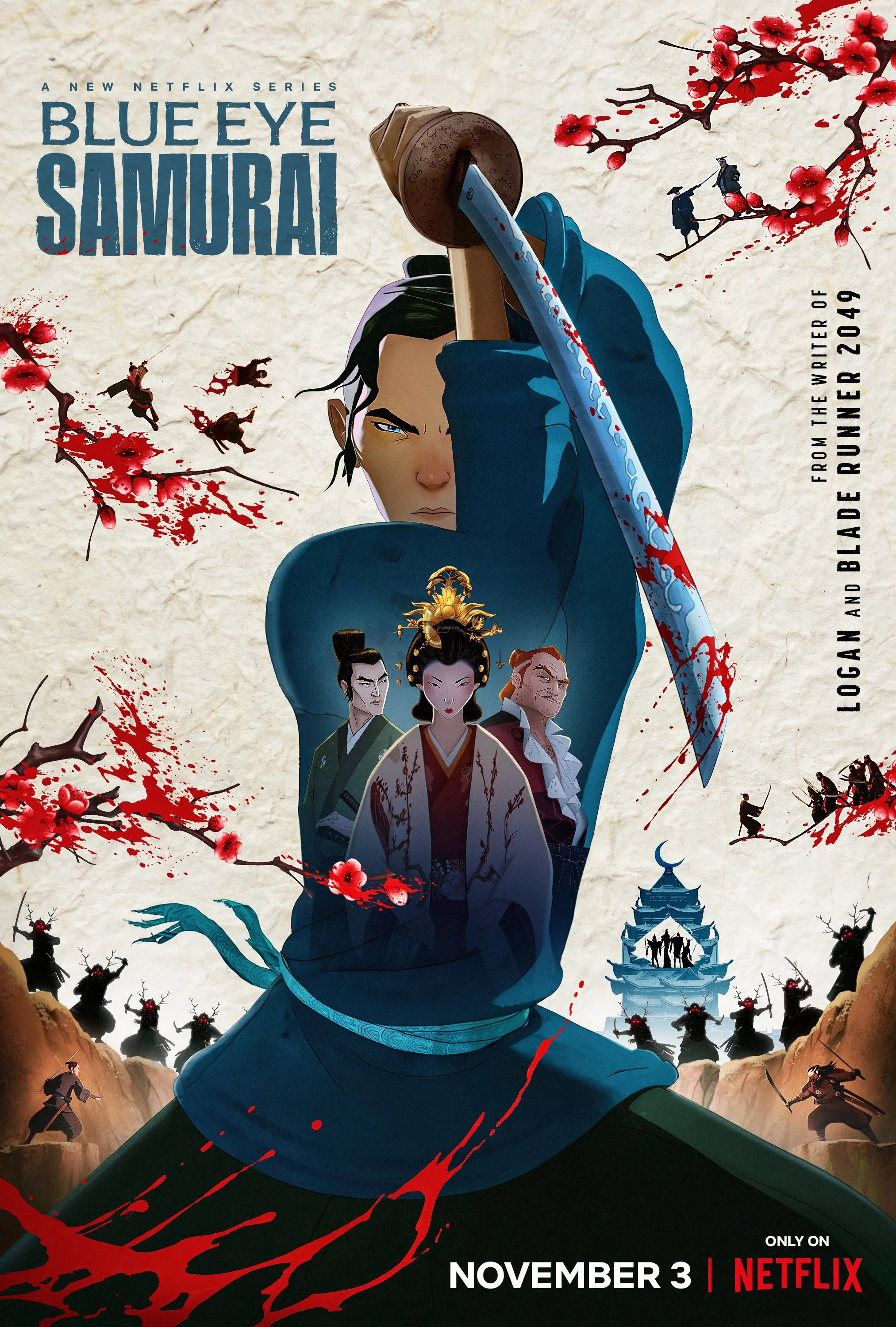
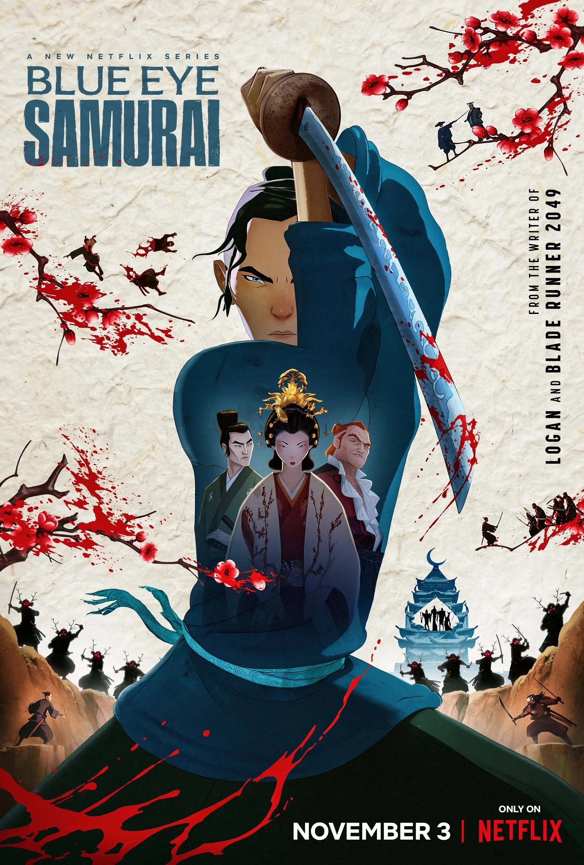
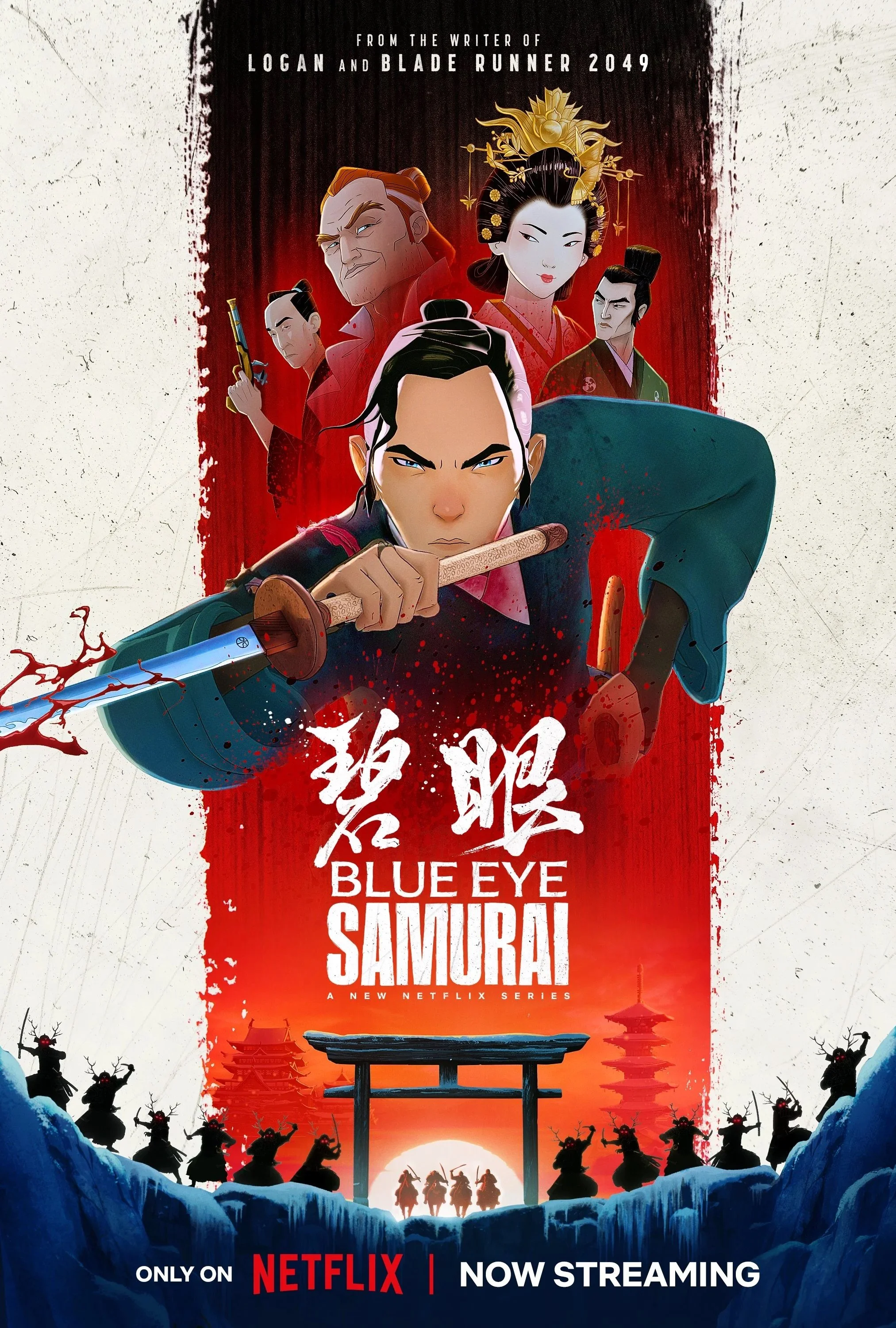
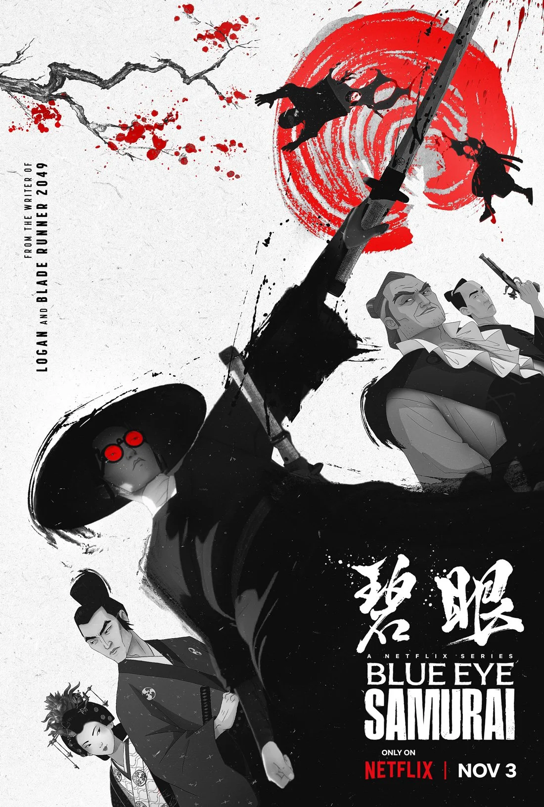
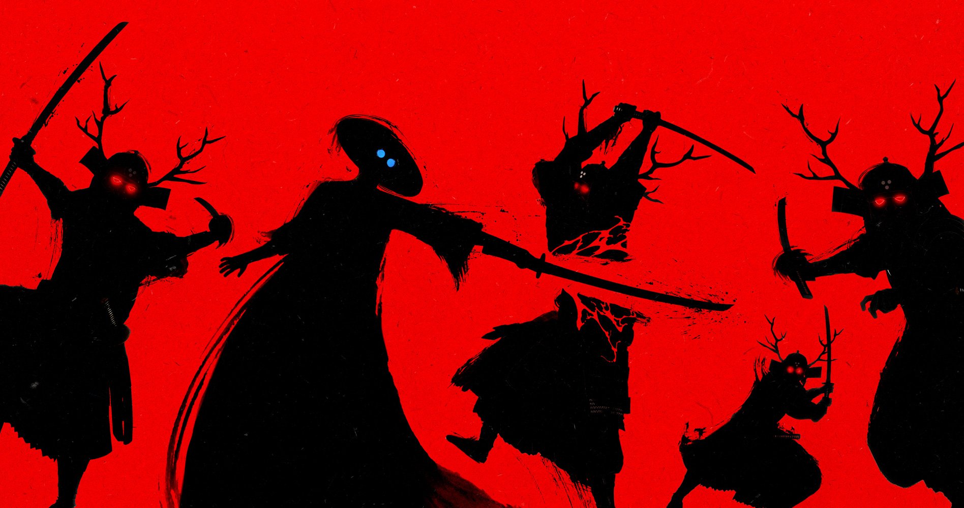
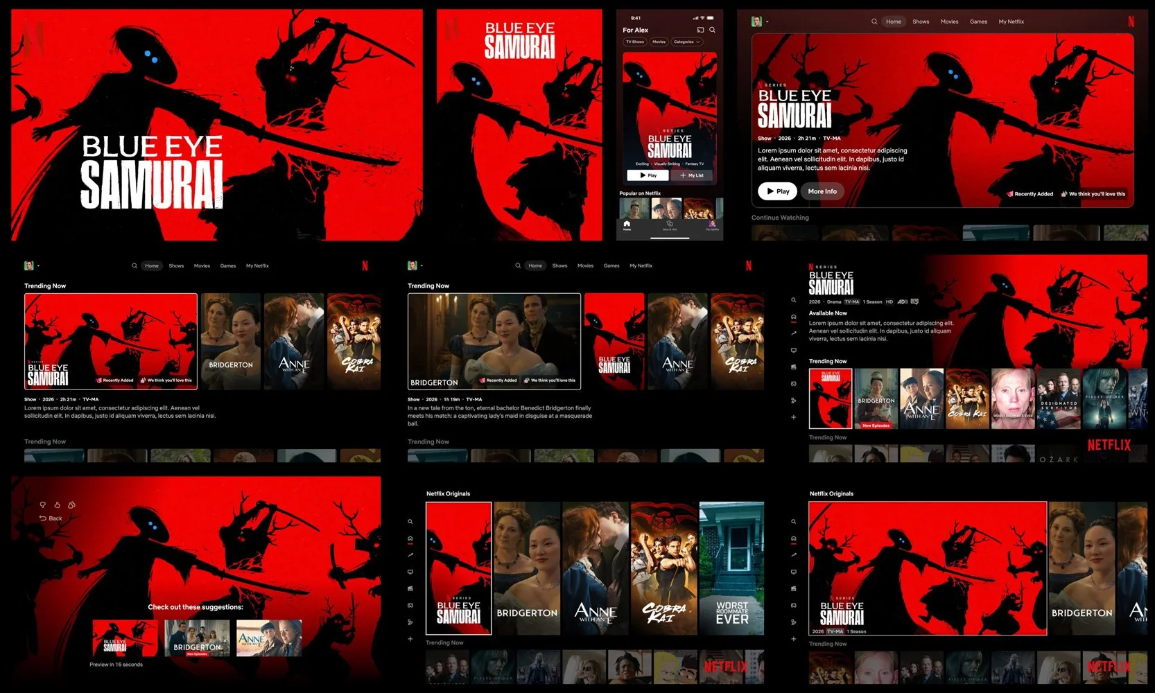
Blue Eye Samurai / Season 1
-
The artwork sought to convey an iconic samurai presence while reflecting the show’s modern tone — balancing stoic composure with explosive, life-or-death intensity. The imagery explored how honor, vengeance, and emotional restraint could coexist within a single, immediately readable composition.
-
The central concept merged traditional samurai iconography with the series’ visceral violence. Cherry blossom petals were reinterpreted as blood splatters shaped like blossoms, combining beauty and brutality to mirror the show’s tonal contrast between stillness and vengeance. The hero pose was constructed as a composite from multiple shots, as no single frame fully captured the desired gesture and expression.
-
Animation assets were limited and still in pre-production, requiring extensive frame pulls, masking, and compositing to build a cohesive image. Background elements such as shadowed enemies, rock faces, and environmental details were sourced and layered to create depth and narrative context. The final artwork involved managing numerous layers while maintaining clarity, character recognition, and strong visual hierarchy across multiple campaign formats.
-
The resulting key art balanced stylized artistry with clear character focus, translating an unfinished animated world into a refined, production-ready visual. Through iterative refinement and close collaboration with creative leads, the final piece achieved a cohesive tone that felt both graphic and emotionally grounded while remaining legible at scale. The final key art was recognized with a Clio Award.

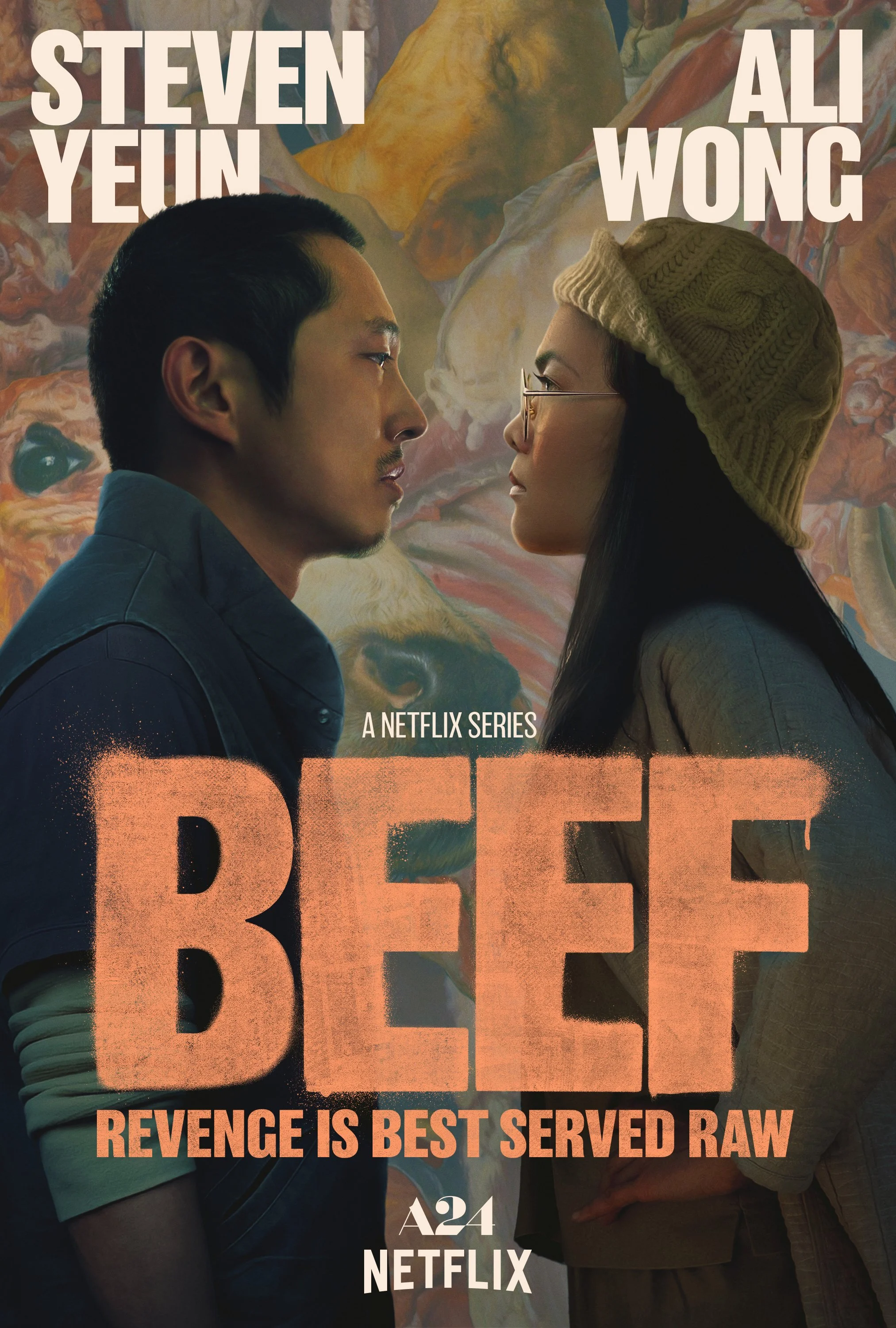
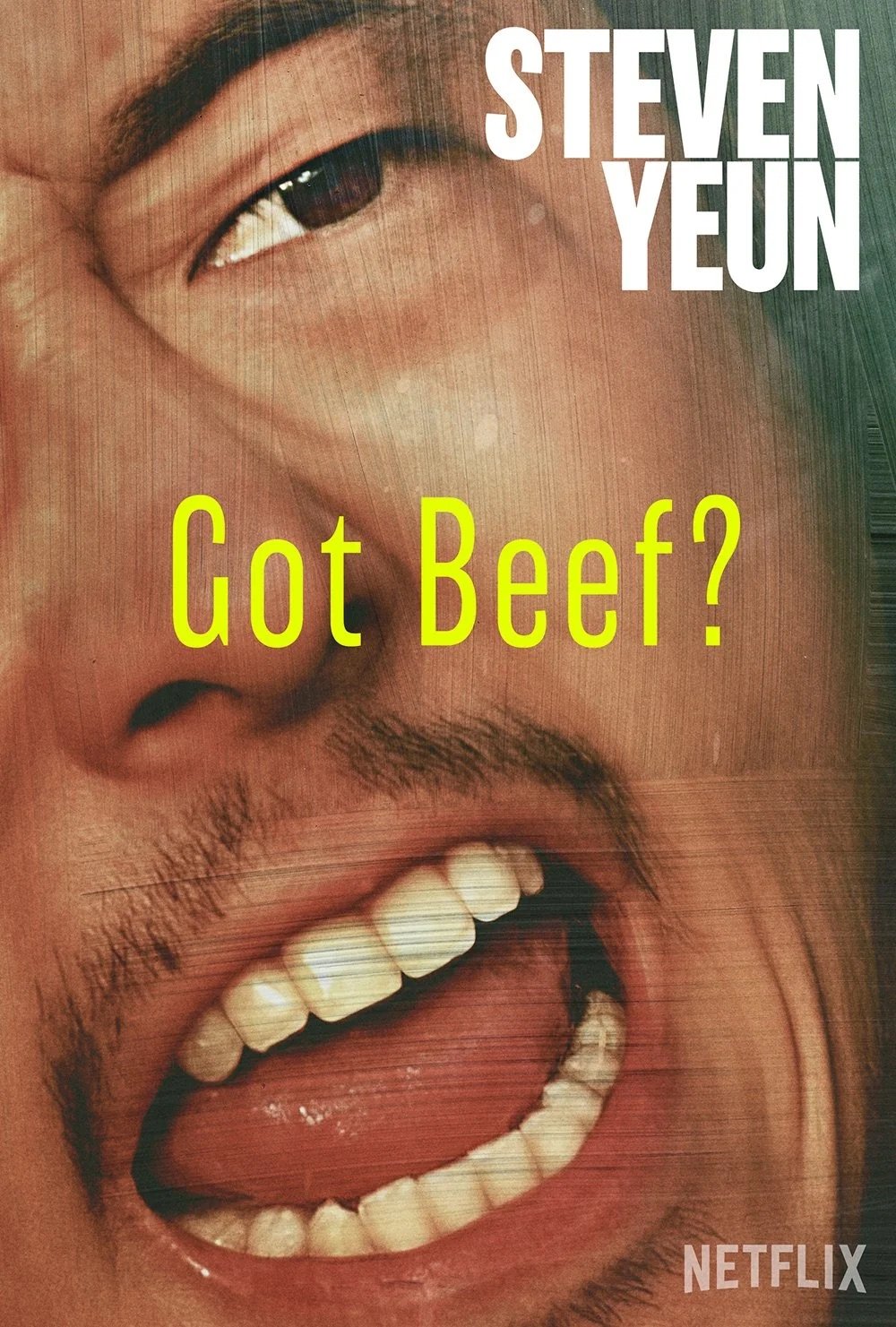
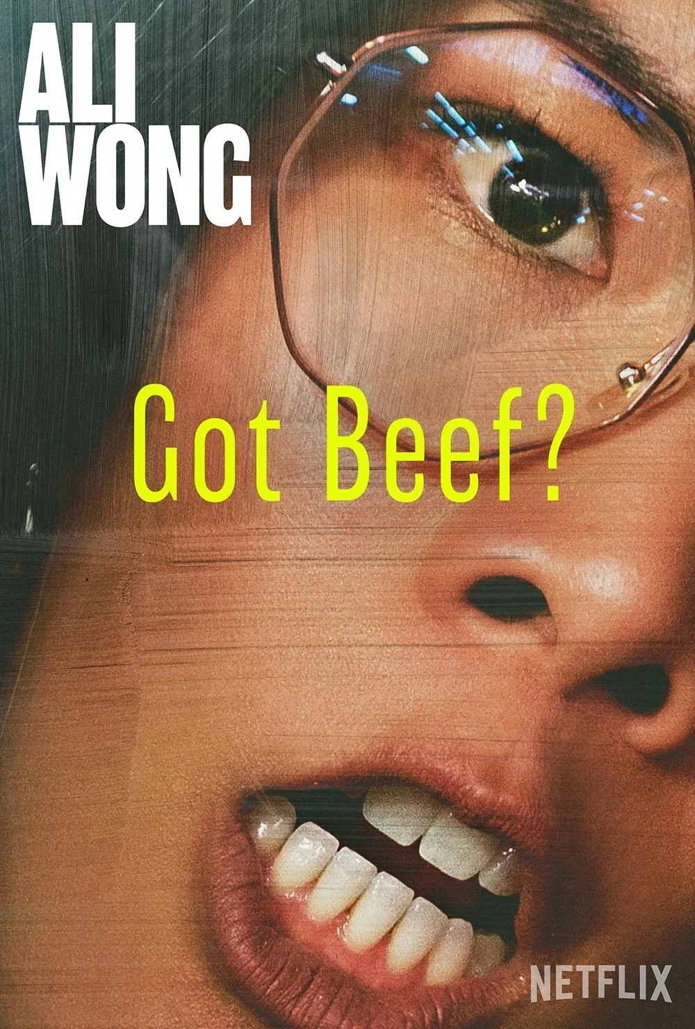
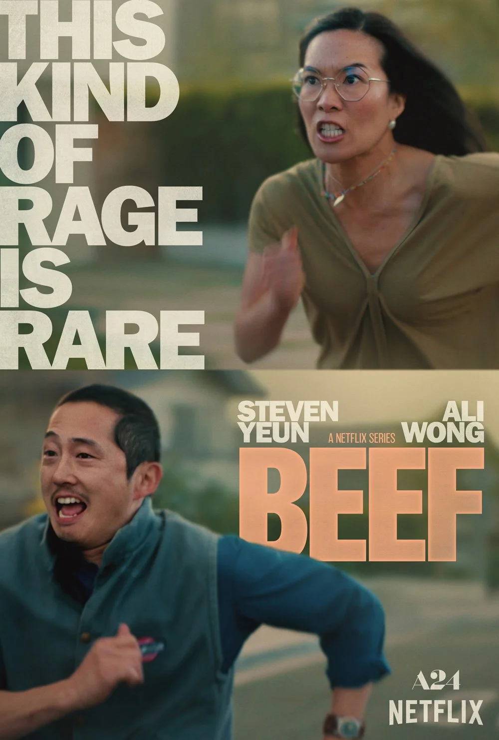
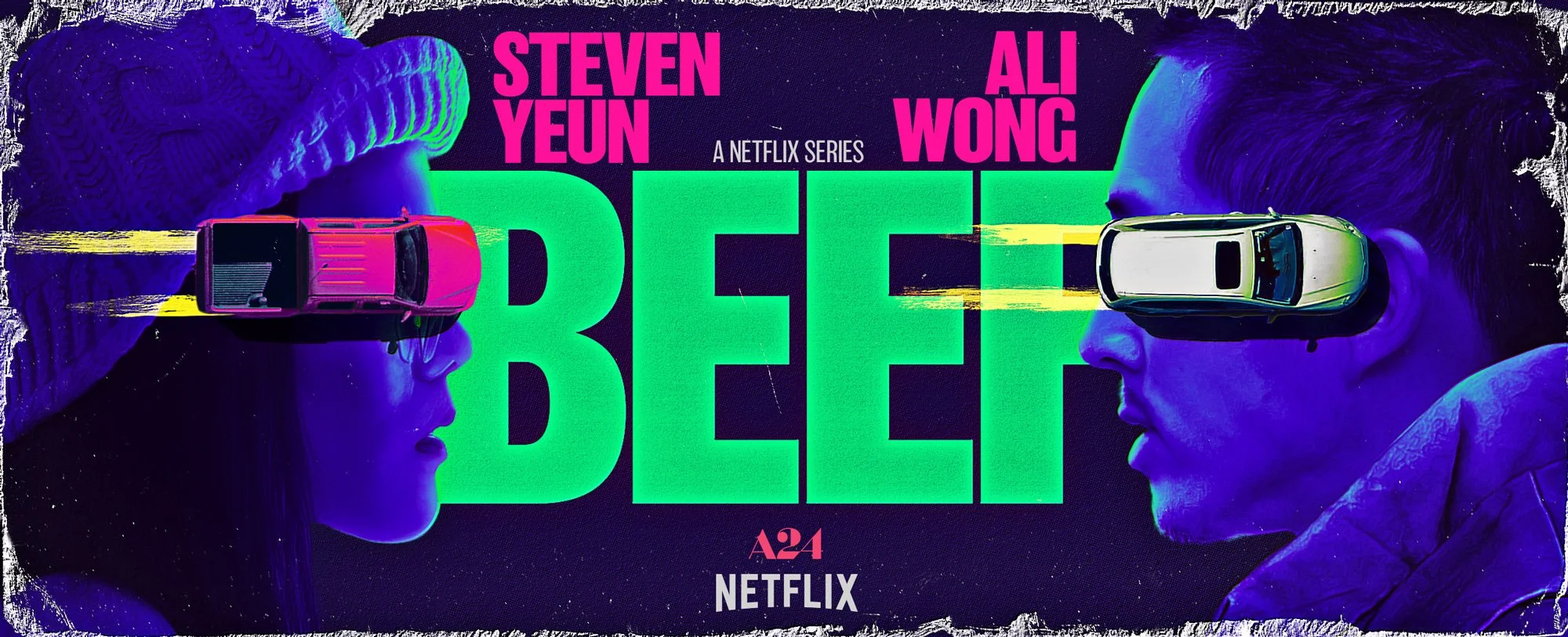
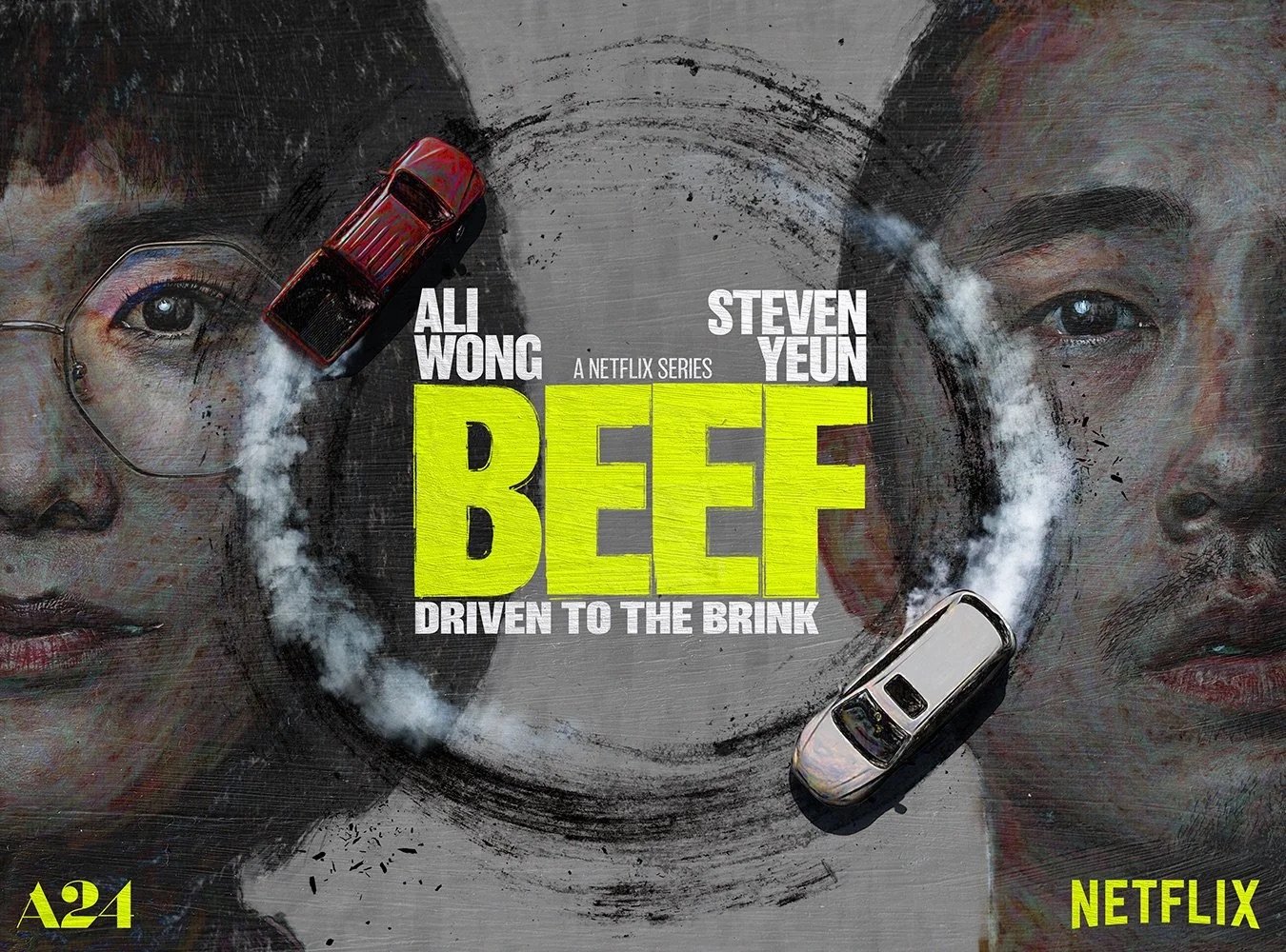
BEEF / Season 1
-
The visual concept centered on capturing the escalating emotional tension between two strangers locked in an increasingly destructive rivalry — essentially an adult game of tag with ever-rising stakes. The imagery needed to convey cyclical pursuit and psychological confrontation, while remaining clear, legible, and talent-forward for broad audience recognition.
-
Early concepting focused on visual metaphors for an endless cycle of retaliation. One direction placed the characters’ cars in a circular overhead chase, suggesting an inescapable loop, with the vehicles running over their portrait faces to reinforce the show’s themes of defacing and pranking while still maintaining recognizability. This more experimental direction drew from high-art portrait compositions and painterly framing. In parallel, a more direct face-off composition was developed to emphasize character tension with immediate clarity. Multiple thumbnail-driven concepts were executed and iterated to test the balance between conceptual boldness and commercial readability.
-
Available assets did not include in-camera face-off photography, requiring extensive compositing to construct a believable confrontation. Separate head and body elements were matched for lighting, angle, color, and value to create a seamless illusion of interaction. Additional considerations included maintaining strong talent recognizability, ensuring typographic legibility, and preserving clarity across various platform formats and breakouts.
-
The final key art settled on a refined face-off composition set against a surreal, painterly background inspired by the show’s thematic use of visual art. While more experimental concepts were explored, the chosen direction balanced conceptual tension with commercial readability. In addition, a series of tightly cropped, emotionally charged character portraits created for wild posting extended the campaign’s tone and later received a Clio Award.


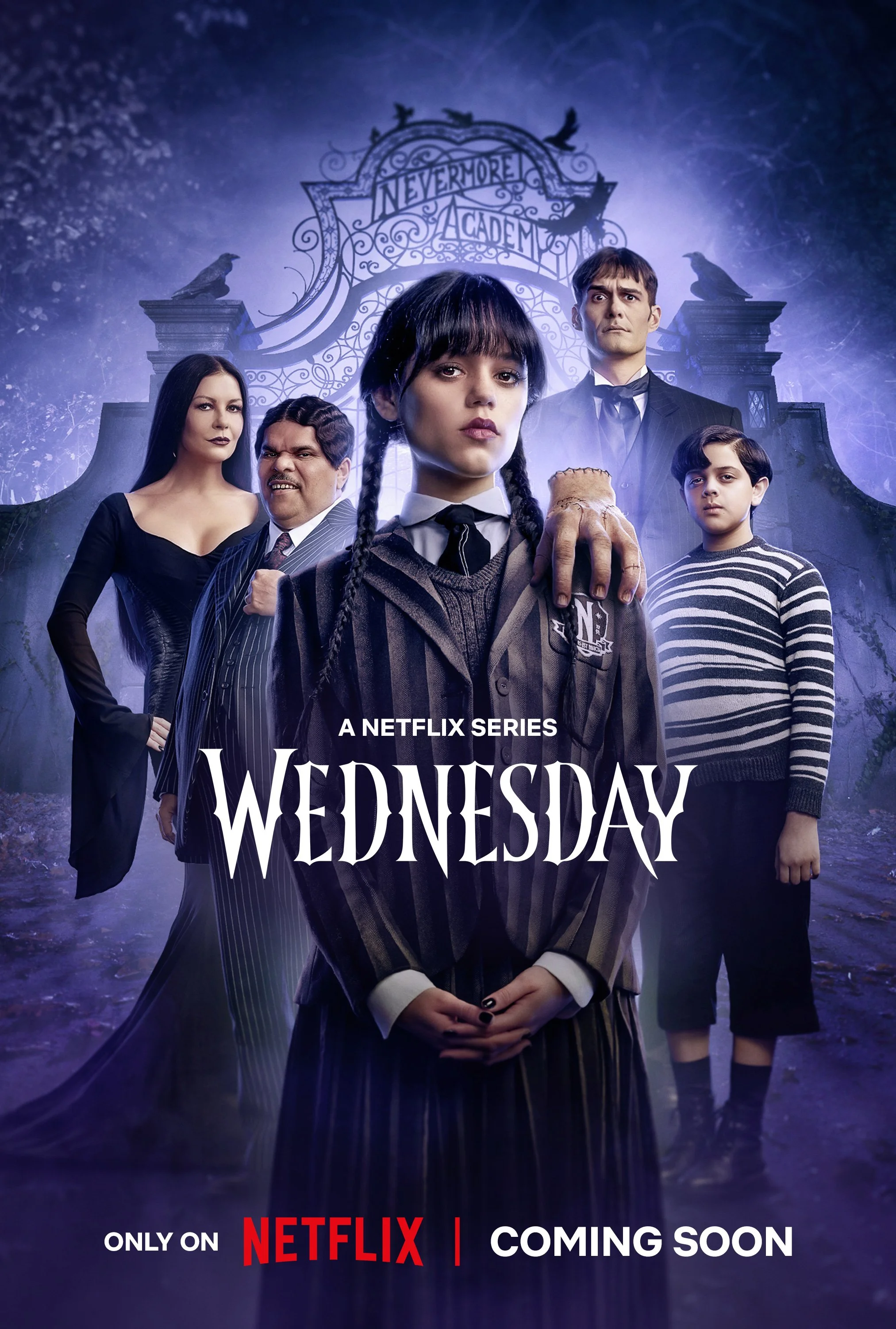
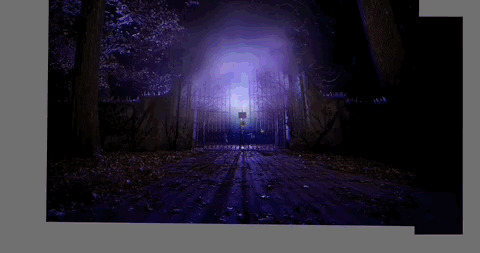
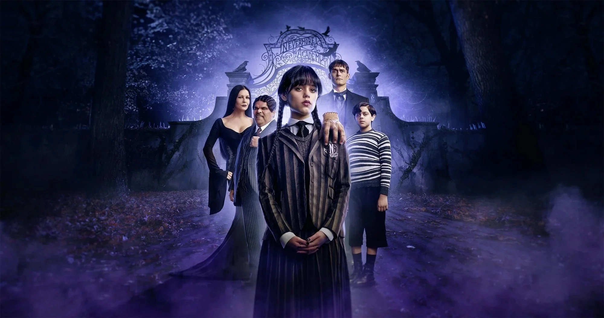
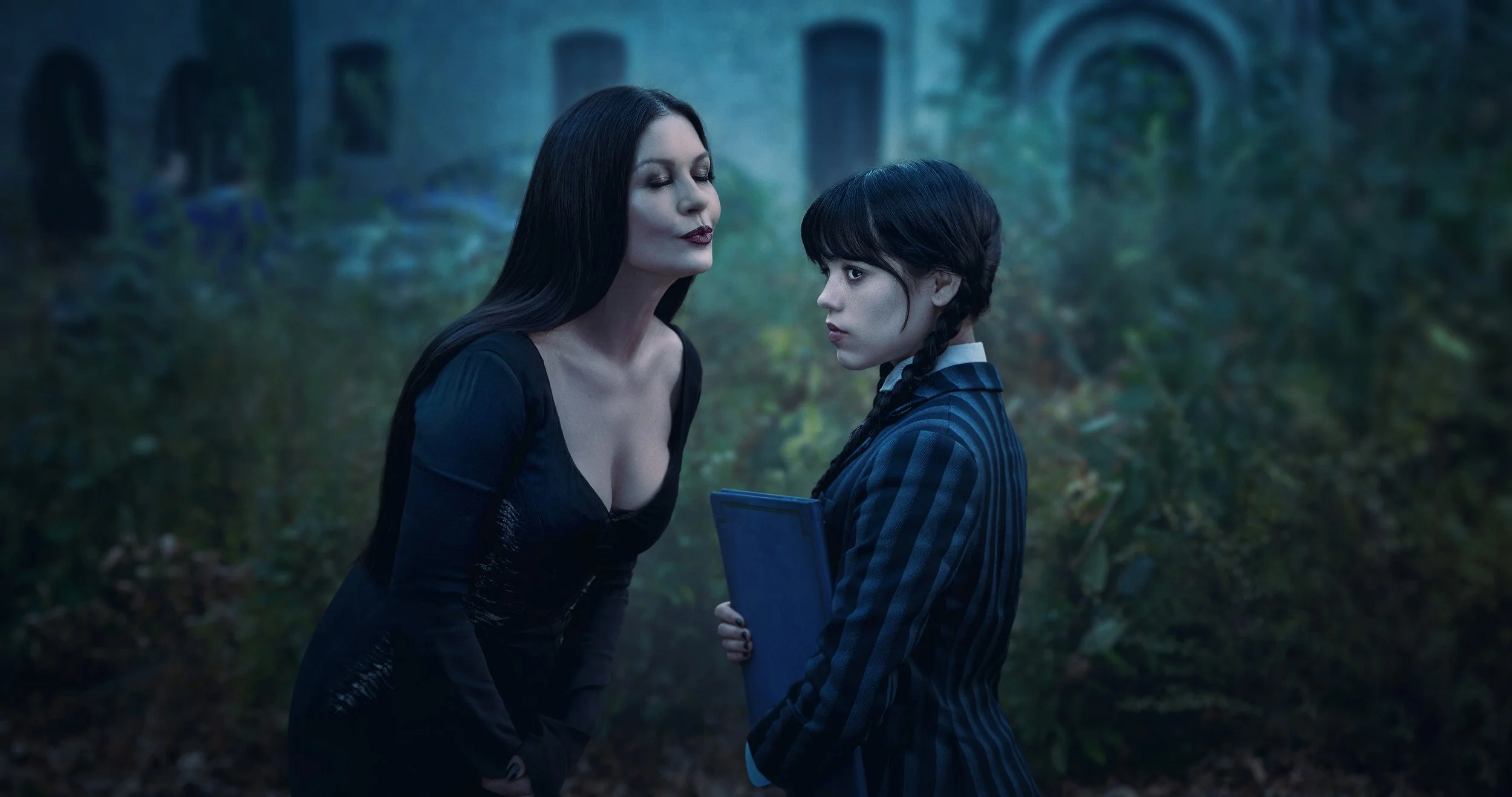
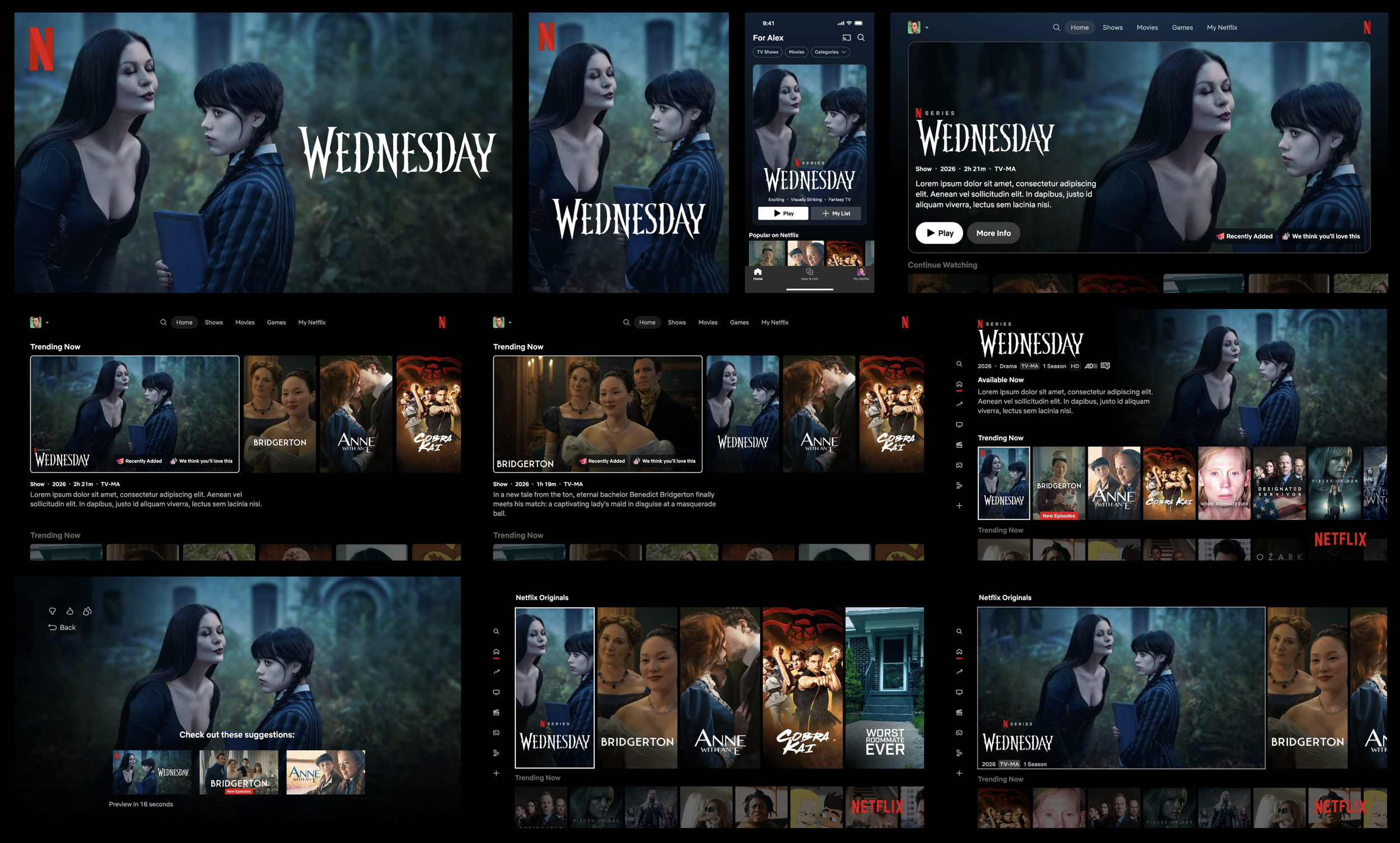
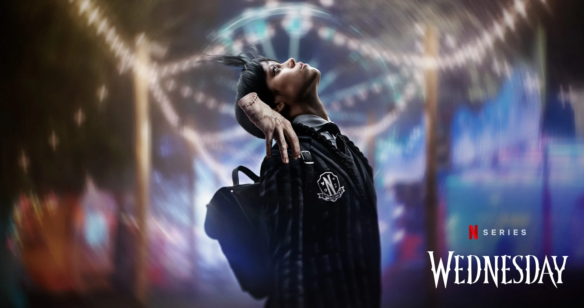
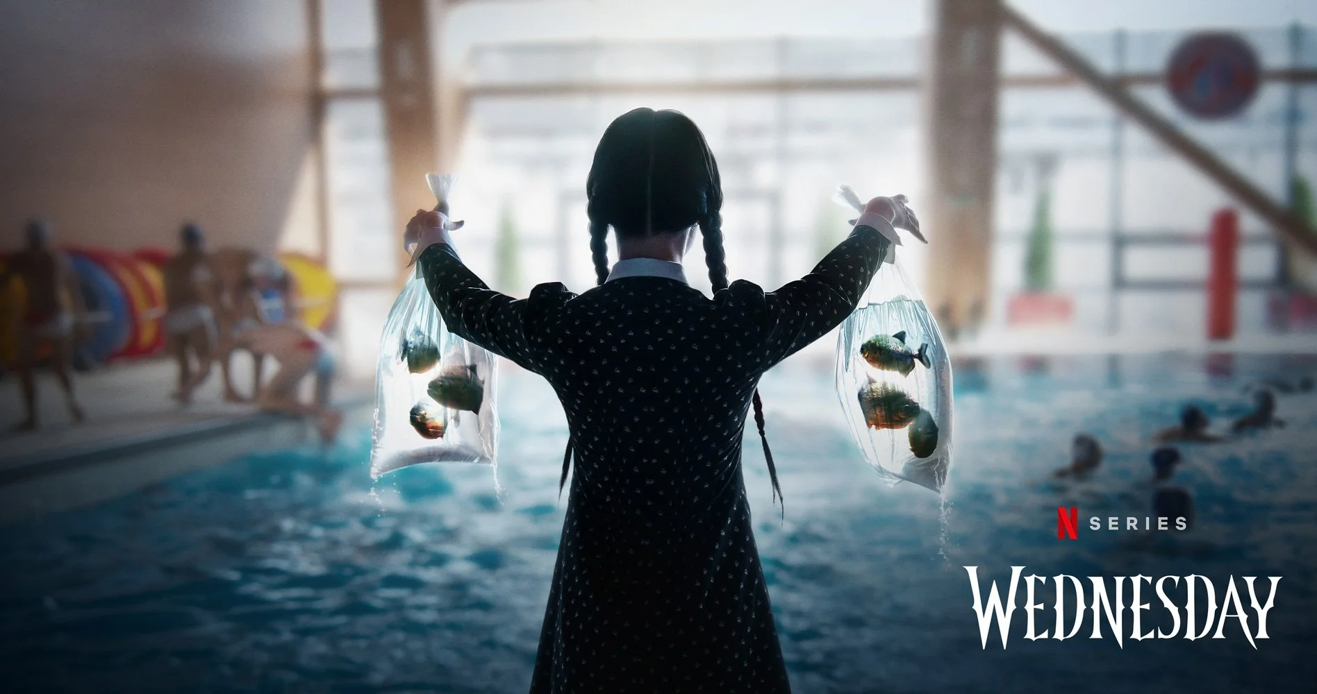
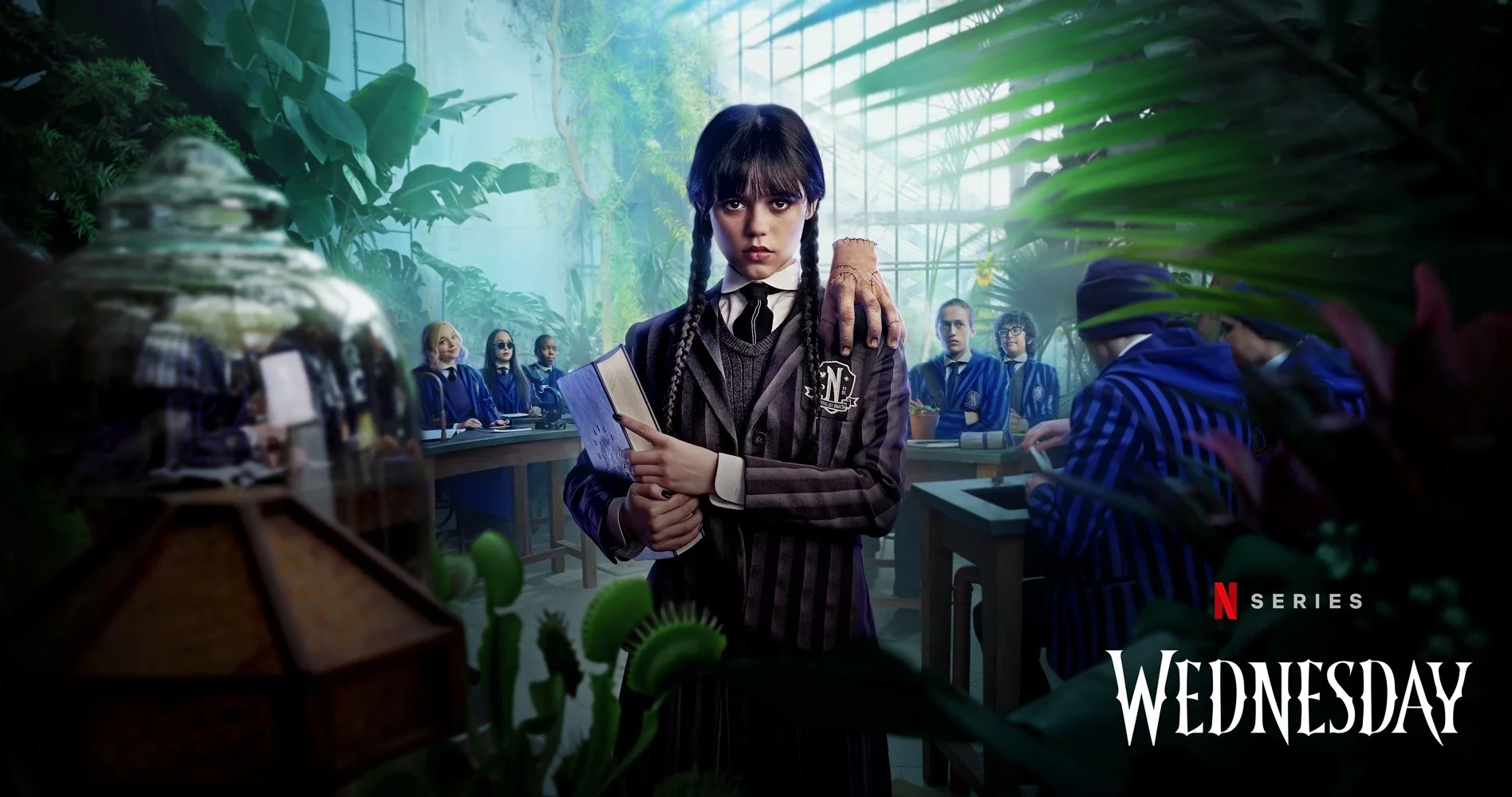
Wednesday / Season 1
-
The product suite explored how to translate the series’ dark comedic tone into imagery that honored the Addams Family legacy within a contemporary, Tim Burton–inspired world. The visuals needed to balance macabre atmosphere with subtle wit, presenting Wednesday as emotionally restrained yet quietly expressive while maintaining strong talent recognition and cinematic polish.
-
Concepts began with extensive thumbnail exploration to capture key story beats and tonal contrasts across the product suite. The direction focused on translating pivotal scenes and character dynamics into clear, composed visuals that felt faithful to the show’s gothic aesthetic while remaining immediately readable. Particular attention was given to portraying Wednesday with stoic composure and a hint of internal amusement, reinforcing the series’ blend of darkness and dry humor.
-
The artwork required close alignment with Tim Burton’s established visual language, including precise color palette expectations and character presentation details (such as the handling of elements like Thing). Unit photography also needed to be translated into product-ready imagery that matched the look and finish of final frames, despite differences in lighting and production context. Maintaining consistent tone, talent presentation, and clarity across multiple deliverables was essential.
-
The final product suite captured the series’ balance of gothic darkness and understated humor while preserving strong character clarity and visual refinement. Aligning closely with an iconic directorial tone while adapting imagery for scalable product use reinforced the importance of tonal precision and high-touch compositing within large-scale commercial campaigns.

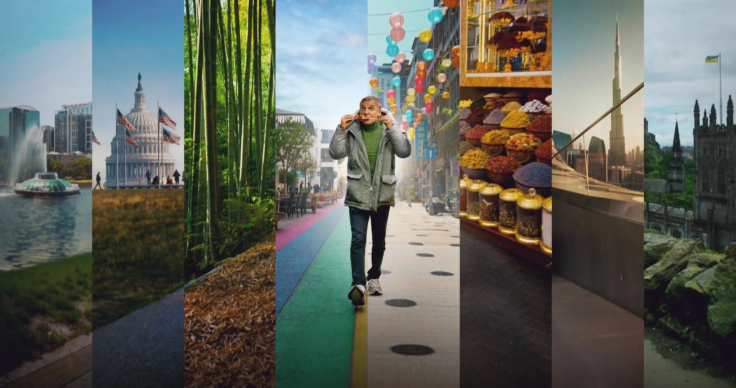
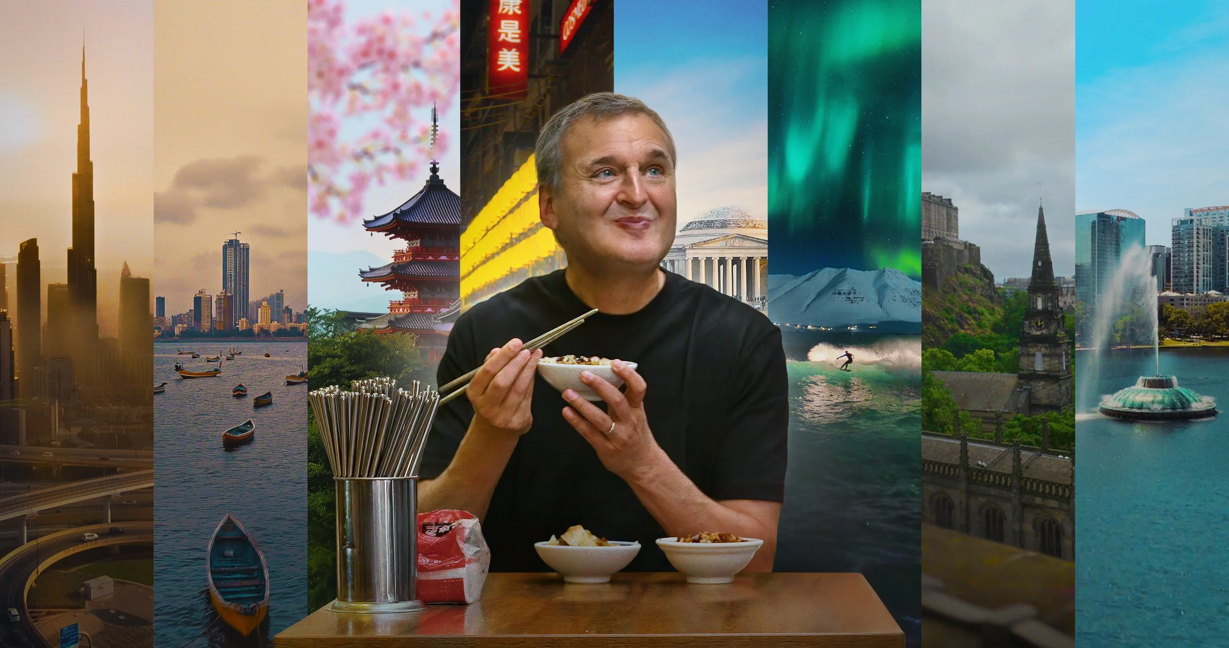
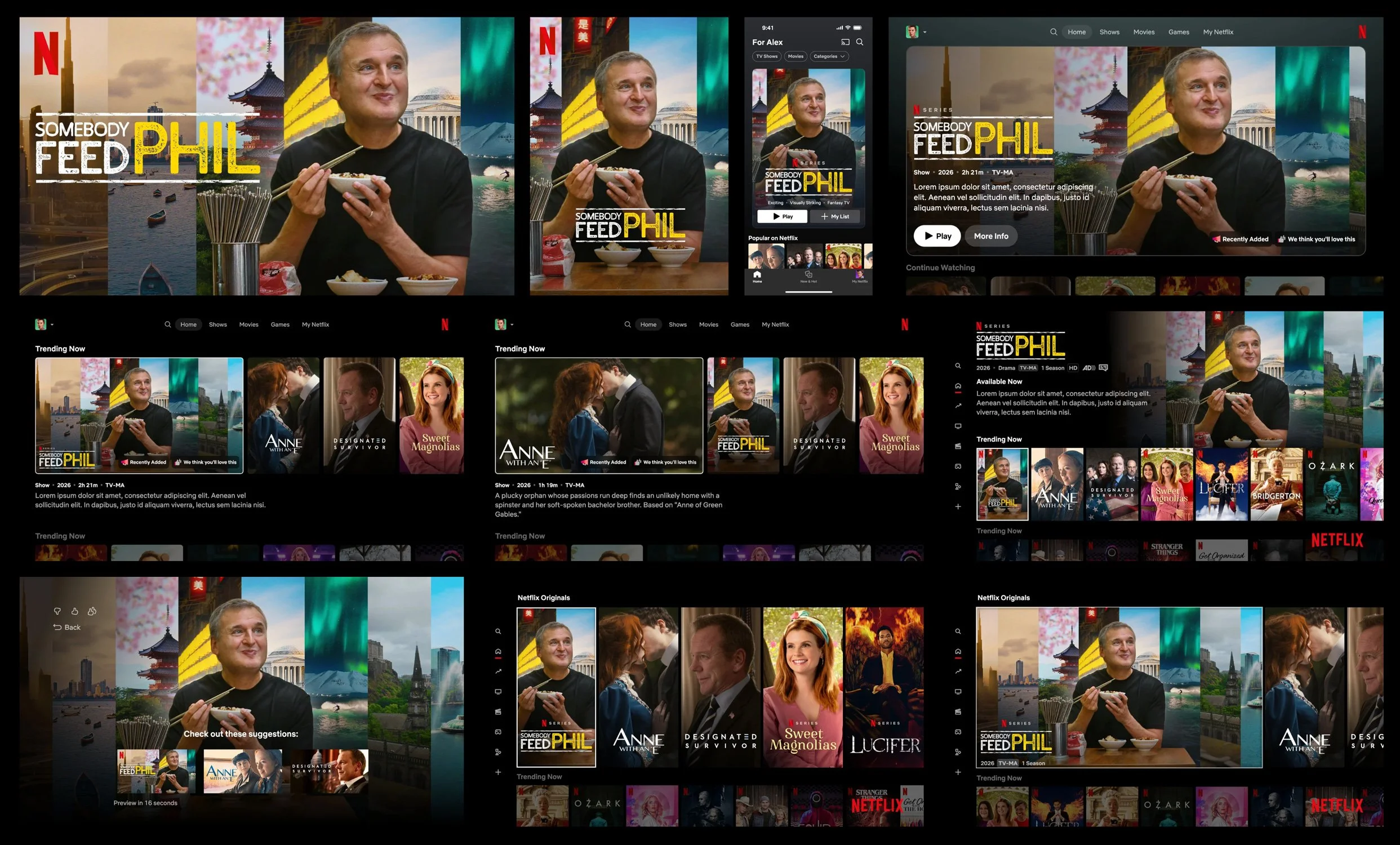
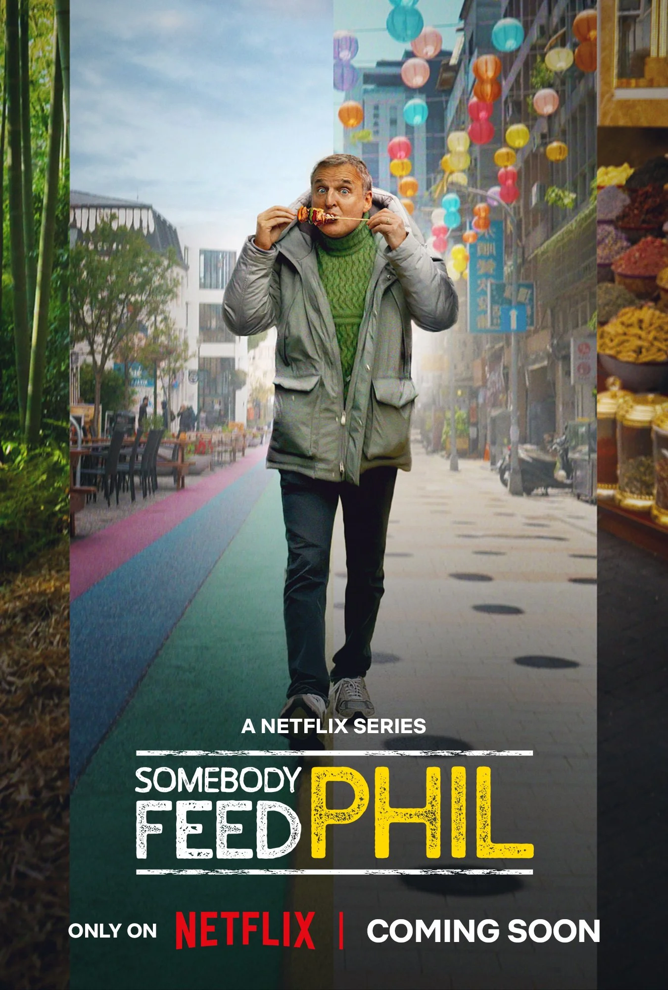
Somebody Feed Phil / Season 7
-
The direction focused on expressing the show’s sense of global joy, curiosity, and human connection through a single cohesive image. The artwork needed to convey worldwide travel, diverse cultures, and Phil’s warmth and enthusiasm while remaining clear, readable, and centered on his recognizable personality.
-
Early concepts explored how to unify multiple international locations within one composition while maintaining visual harmony. Thumbnail exploration led to a panel-based solution with a shared horizon line, allowing each region to retain its own color world and environmental identity. Phil was positioned centrally, walking toward camera while joyfully eating, acting as the connective thread between locations and experiences.
-
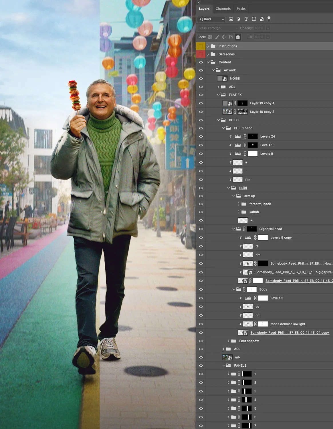
Available assets were limited to in-show frames, requiring full episode review to source and mask usable imagery. Each location needed to be represented in a small visual footprint while still feeling authentic and legible at scale. The composition also needed to maintain strong talent recognition and accommodate platform breakouts, all while blending distinct environments into a unified visual world.
-
The final composite balanced global variety with compositional clarity, presenting Phil as a joyful guide through multiple cultures and cuisines. The process reinforced the importance of narrative cohesion, careful horizon alignment, and tonal warmth when distilling a wide-ranging travel experience into a single, readable campaign image.